
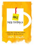
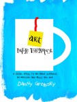
My editor, my design director and I have been working on covers for the new book all summer. We all love the final design but I thought you might look a peek at the top 25 contenders (trust me, there were many, many others!)
(CLICK ON ANY IMAGE TO OPEN THE GALLERY)


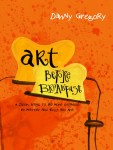


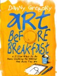
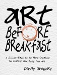
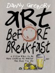


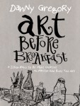
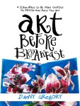
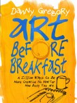
And here’s the winner:
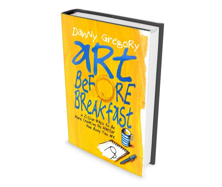

Great choice! Before I saw the winner I decided I liked the two options of blue text on the yellowy-orange background. Looking forward to getting hold of a copy when it’s published.
LikeLike
I like the winner, but like the reflective toaster best.
LikeLike
Looks SO great. Thanks for taking us through the process. Think the final answer is great. Can’t wait to read it!
LikeLike
Great cover and I can’t wait to get the book…my choice would have been your reflection in the toaster though…that was genious!
LikeLike
When will your book be coming out? Can’t wait.
LikeLike
Great selection! Looking forward to a purchase of this book as I usually get out of bed at least two hours before breakfast
LikeLike
Before I saw the winner, I thought the white and black was the strongest graphic design. But once I saw the winner, I was very happy with the choice. Honestly, I’ve seen enough “Toast” to last a lifetime! LOL.
LikeLike
Loved the tousled bed drawing, but your first choice was indeed the best choice
LikeLike
Oh goodie!! Another book! Love your books! Great cover choice!
LikeLike
They are all wonderful choices… and all so different!! I bet it was difficult to decide. Funny though, when I saw the winner I’ll be honest, it wasn’t my first choice. When I took a closer look I see it really IS the best one. I can’t wait til it comes out! I’m a retired ‘book seller’ and sold sooooo many copies of Creative License… I’m sure there’s a built-in audience just chomping at the bit for this one. BTW… You really CAN judge a book by it’s cover 🙂
LikeLike
Beautiful! Sunny and Bright and to the point. I’m an art director and have designed some book covers and know you have to go through LOTS of versions sometimes to get what works. Oddly sometimes the first idea winds up being the best one. Don’t know if that’s true here, but I can’t wait to buy it! I think this was in my top three, but I did love the loose plate one in upper right, and thought it might be fun if the knife and fork were a pen and paint brush. I also liked the one directly below it with just the loose toaster lines. You could have a book of just all your designs of this cover!
LikeLike
Great choice Danny! This cover is by far the best, though there are others that stand out.
LikeLike
Reblogged this on Imagewright and commented:
As a book designer by trade, this was fascinating. Gonna have to pick this up.
LikeLike
I’d have struggled to resist the one with “tart” on it! Much look forward to the contents …
LikeLike
Fun to see all the designs you went through in this process. Looking forward to your new book coming out!
LikeLike
Reflective toaster is my favorite too. but I’ll buy the book, whatever the cover!
LikeLike
I liked the mug on blue bg myself … 🙂 but sure will be a great read regardless
LikeLike
The winner is lovely and sunny and inviting…but I would frame the candidate with the reflective toaster. Love it!
Will love this newest regardless of what the cover is though.
LikeLike
Every morning needs sunshine….even on a rainy day! Great choice! Can’t wait to read it!
LikeLike
Love the title – and hope to get a copy too – also – I liked the first few with the blue background – but then coming to the one that was chosen I nodded because it is good. The words are large and clear and the whole arrangement is nice – and I have not been following you for very long, but the dust jacket feels like an extension of your blog – with the brush strokes and white edging and even the use of the word “zillion” – oh – and lastly, this seems like a great idea for a book – offering ways for busy folks a way to tap into some creativity – best wishes on any final things you need to do with it.
LikeLike
the winner is the one I picked out…it grabbed me the most..I think the bright blue lettering did it at first and then the rest of the design all set so well……winna
LikeLike
What struck me most about this post (apart from seeing the exciting, vibrant covers) was the reminder of the hard work that goes into making a book. The drawing and re-drawing; the tweaking of colour and text; the countless draft designs that are generated until eventually a final decision is made.
Most people would stop at one or two designs and be content with a limited choice.
Danny, you have reminded us of the hard work and commitment that is involved with making art, whether it is a book cover or a sketch.
LikeLike
Awesome! I’m so looking forward to the book! 🙂
LikeLike
I thought the toaster was great too. I can’t wait to get the book. I’m going to order one for my niece too because if I don’t I know she’ll take mine. 🙂
LikeLike
Love the choice! Congrats on your new book! Can’t wait to get my hands on it 🙂
LikeLike
love the cover. but most importantly love that there’s a new Danny Gregory book coming!!
LikeLike
Hello DAnny
really difficult choise! But the colo orange is “for me” the best choisi!
Where can I see this publication?
Thank you
LikeLike
orange/yellow !!!
LikeLike
cool…that is one I would have picked
LikeLike
I approve! Great choice! Glad you didn’t choose the toast one… I thought it was a nose at first glimpse!
LikeLike
YAY, I win, I chose just the one you and your editors did. Ahhh, you guys have good taste. ;o)
LikeLike
I won, too! My favorite was chosen.
LikeLike