

The next big influence on my iPad exploratory was a tech innovation from centuries ago: moveable type. In Mid July, I took a week-long workshop in letterpress printing at the Center for Book Arts and it was quite profound. I wrote about it soon thereafter.
In the process of figuring out how to compose the type, I first created a layout comp in InDesign. Then I tried to replicate it at the press with hand set lead type. It was impossible and, I realized, pointless to try to just mimic one technology with another. Sure, I could just hit “print” on my laptop and my laser printer would crank out the page with no-muss or fuss. But that defeated the whole point of the experience. And besides, it wouldn’t actually look the same. So, I decided to push my hand set type as far into its own domain as I could. I used big wooden typefaces and printed it in graduated colored inks. What I printed was too big, too organic, too imperfect to have been made on a Mac. And that’s what made it special.
This revelation started to haunt my iPad exploration. What was I doing with this gizmo? Why was I trying to reproduce my 180 lb. sketchbook pages, my steel nibs and dip pen, Felix’s watercolors — with this $1000 tablet? It was so cheesy and lame.
Instead I had to embrace the way the iPad worked, go towards it — rather than trying to create a synthetic echo of the art I’ve always made. I’d have to be Dylan going electric. Frampton on TalkBox. Cher on AutoTune.
The next week, Tommy Kane and I did some urban sketching around town, perched on our little folding stools. I knew Tom was not impressed by the gizmo or my efforts so far, but I needed to push myself into a new way of seeing, to try to discover how to create something that I could only do on the iPad.
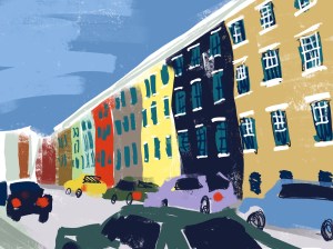
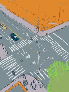
I started to work in block shapes in layered bright colors. In some drawings, I processed the layers to create unexpected effects. I even turned on brightly hues street scene in a study in shades of grey by just flipping a slider.
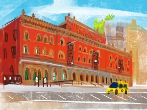
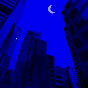
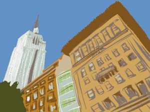
Two particular drawing that I did on while sitting on the curbs of the Village started to capture something new. One I drew of some NYU building on West 4th Street in bright cartoony colors. Then Public Theatre on Lafayette Street and finally a corner off Washington Square late at night.
They all had a hand-drawn, anarchic and unplanned feeling, sort of evocative of 1950s Ronald Searle inspired animation — but not quite. And the thing is, they had colors that were impossible to create on paper, in any other medium.Print them out and they’d be dead. They were made of light. They were those amazing intense colors you only get by looking at a screen, utterly modern, and they made those street corners come alive. They were unlike anything I’d made before, and I was very happy.


(To be continued)

Wonderful series, Danny. I hope it lasts forever 🙂
LikeLike
Danny am loving your iPad art. Just checked your Instagram images and smiled the whole time. Hope you’ll teach iPad art on SBS!
LikeLiked by 1 person
Oh! I second this!! I still have so much to learn about drawing w/ pen and paper, but your iPad art and that of others is soooo intriquing to me…I just might have to buy myself a Christmas present!!!!
LikeLike
Thanks. And my instagram feed appears in the right hand column of this page
LikeLike
Some journey Danny thank you for sharing it. Also enjoyed reading the July post again.
LikeLike
Danny, this stuff is amazing! After your post yesterday I started the one hour tutorial you referenced on Procreate! I am intimidated, but intrigued…..Truly inspired by these posts md your sharing of info. I am going to forge on and see what I can create outside of my sketchbooks. I see many opportunities here. Thank you🙂
LikeLike
Be brave!
LikeLike
Hi Danny….the colours you created remind me of the colours I get when I use Posca Pens. Have you ever used them? I think you’d like them. Unlike other markers, you can draw one colour on top of another. Vibrant effects. Thanks for your article. Cheere Ethna
LikeLiked by 1 person
When does the iPad Pro sketching class start? where you share all your tips and shortcuts??? : )
LikeLike
You’re reading it, crehfeld.
LikeLike
Yes, I agree! I would sign up for an iPad Pro klass with tips and shortkuts in a NY minute!
LikeLike
Great start on the iPad Danny but I still like your sketches and calligraphy best.
I have always enjoyed the work Don Low does with Procreate, check it out.
I have an old advertising steel ruler from the “Type House” Day and Night Service- 62 West 45th Street, New York, phone Longacre 3 2376. How it ended up in Vancouver BC Canada is a mystery..
LikeLike
I think the point of my exploration is that I do too. I’d like to get to a point with the iPad where I like my work on it as much as my “sketches and calligraphy” I’ve done the former for six months, the latter for 20 years so let’s see where I get to before passing final. judgement. I know Dons work. He’s good.
LikeLike
… and what did Tommy think of your efforts of that day? I hope he felt a degree warmer to the possibilities of an iPad as an art tool. I have been dabbling off and on half heartedly. Your posts have been so honest … I am impressed with your perseverance. I love the dogs and the street scene above has inspired me to think again about getting out my stylus. Wish they would make the Apple Pencil compatible with the IPad Air.
LikeLike
I don’t try to change Tommy Kane’s mind about stuff. I love what he does and I leave it at that. I am a Virgo which apparently has something to do with my tenacity. Or with the fact that I was born in early September, I dunno.
LikeLike
I’m glad I’m not the only one who has ever felt cheesy and lame! The night drawings are my favorite! Thanks for sharing, Danny!
LikeLike
Thanks, Stacy. I like the night scenes too. They really emphasize that these drawings are really just made with light.
LikeLike