abb cover 18 Posted on August 15, 2014 by dannygregory Share this: Share on Facebook (Opens in new window) Facebook Email a link to a friend (Opens in new window) Email Share on LinkedIn (Opens in new window) LinkedIn Share on X (Opens in new window) X Share on Tumblr (Opens in new window) Tumblr More Share on Pinterest (Opens in new window) Pinterest Like Loading...
Please can we have a design where you have a proper capital A and T for art. I hate the mix of lower case and upper case letters. Please don’t tell me it’s ‘arty’. It’s wRonG! LikeLike

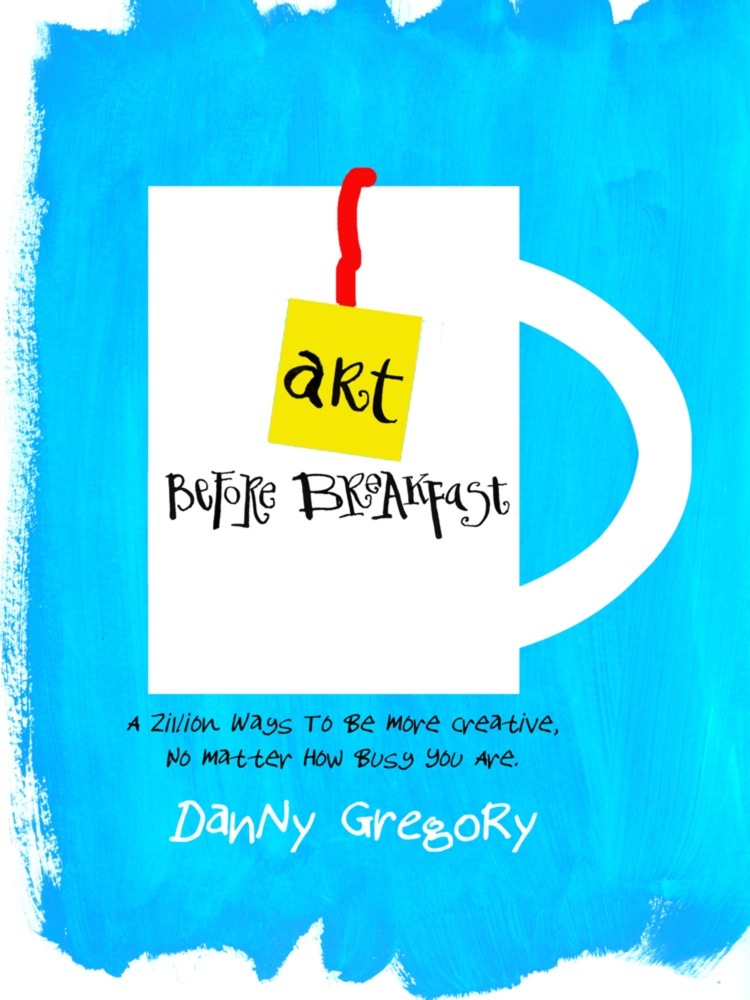

This has a first-thing-in-the-morrning feel to me.
LikeLike
Please can we have a design where you have a proper capital A and T for art. I hate the mix of lower case and upper case letters. Please don’t tell me it’s ‘arty’. It’s wRonG!
LikeLike