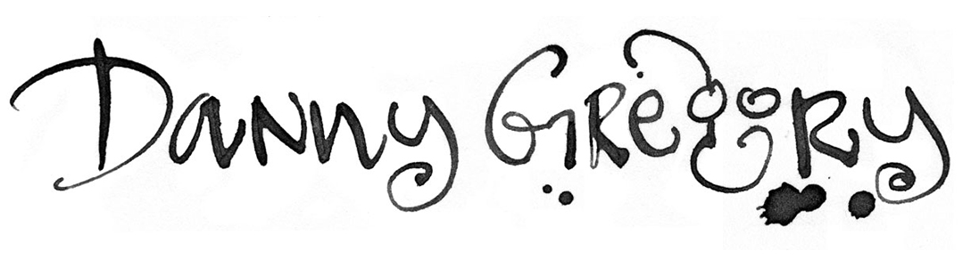
When you’re designing a book that will be entirely handwritten, you have two choices. You can be as patient as Frederick Franck and get a bunch of pens and set to work, writer’s cramp be damned. If you are as inconsistent and sloppy as I am, better to follow SARK’s example and have a font created based on your handwriting. So when I made Everyday Matters, I worked with Alexander Walter to turn my vaguely cursive upper/lower case writing into a font.
The font worked well for the book but I was troubled by the fact that the point size is set by the height of the tallest letter, including descenders and ascenders. That meant I was also ways having to scale up the letters and that if I cranked down my leading, I would have letters from different lines bumping heads and tails.
Recently I decided to try a new one, based on my other style of handwriting, a printed uppercase face with slightly larger letters for caps. I wrote out the alphabet and all the punctuation and numbers, then copied out many surreal sentences like “You hope havoc and chaos will ebb when you tattoo a kiwi at the zoo” and “A yoga guru will hew the yucca with a hacksaw.” I made a high res scan of all this palaver and emailed it to Alexander and a couple of weeks later, he sent me a link so I could download the font. Alexander also gave me a macro that runs in Microsoft Word to randomize my text. This useful feature takes all of the variations on a given letter that I have printed and randomly substitutes them in to my text. Instead of the same exact Y, for instance, it will insert one with a longer tail, an angled shaft, uneven tines, etc. This helps to give the font the little bit of chaos that makes for verisimilitude.
Jack immediately asked if I would load it onto his computer. I wonder why.
PS: About 50% of Everyday Matters, captions, some of the nuttier pages, is handlettered.
Skip to content