
When I was about six, I started making books. There were so many aspects of bookmaking that intrigued me and I wanted to make them mine.
My first books were stories, with a drawing filling the left page, words filling the right. I made them with crayons and pencils, writing as neatly as I could.
At ten, I wrote a book on dogs, with drawings listing the different breeds. I had sections on dog care, and took photos of my long-suffering dog Pogo to demonstrate how to clean her ears with cotton balls and how her teeth were laid out in her long snout. When they came back from the photo lab, I pasted the pictures into my binder and wrote captions in italics beneath each one. Fig.I. Fig IIa, etc.
Throughout my childhood and adolescence, I wrote diaries, plays, short stories, novellas, and was fetishistic about the manuscripts, making carbon-paper copies, putting each one into a file folder or a plastic sleeve , then archiving them in cardboard boxes or ring binders.
I had my own library, with a card catalog I carefully typed onto index cards, scotch-taped Dewey decimal labels on each spine, and checkout cards in little sleeves on the final endpapers to record who had borrowed each one. I re-arranged my books by height, by color, by author, subject, date of publication, publisher.
He taught me the correct place for an author sign a book, not on the end paper but on the half-title or title page.
My mother sort of understood it. None of my friends did. But for me, there was something very comforting in making books, even if they were lopsided, incomplete, lumpy with glue and typos.
My uncle was very authorial — he had a beard, a Selectric, smoked a pipe, played Schubert lieder. A shelf in his library held his six books in a row, his name on each spine, his author photo on each flyleaf. He taught me the correct place for an author sign a book, not on the end paper but on the half-title or title page.
In high school, I worked on the newspaper and saw my name and words in print for the first time. I have vivid recall of what each article looked like — the number of columns, the placement of the illustration, the size of my byline. I took home stacks of each issue and added them to my archive.
My undergraduate thesis was the first properly bound book I produced, three hundred or so pages on the power of group psychology of student radicals in the 1960s. It was a manuscript bound in plain white cardboard with a black taped spine and a typed label on the cover but, to me, it was a real book and I have it still.
In my mid-twenties, desktop publishing became commonplace and I delighted in setting pages of type, making faux-newspaper layouts, printing out little booklets all written, designed, and printed by me. It was a thrill to see anything I wanted set in type in columns and pages.Then I got access to a scanner and I could make images and wrap text around them. I loved the ker-chunk and thwack of pages extruding from a laser printer, crisp and sharp. I printed out booklets and faux newspaper articles for my family, then my girlfriend, then my wife.
 Twenty years ago, I took some courses in bookbinding. There was something so magical about making a case-bound book. Sure, I’d made pamphlets, center stapling the pages together, and filled ring binders with loose-leaf paper, but they weren’t real books. A real book had a spine and pages that were sewn in. But on my own, I could never figure out how to make one, how it all stayed together in a neat box with a rigid spine. Soon the secrets were revealed and I cranked out perfect-bound sketchbooks. Perfect-bound, yes, but not perfectly bound. My bindings were, like everything I make, wonky, ink-stained, lumpy with adhesive, far from perfect, mine.
A couple of years later, my first book was published and soon, I too had a shelf with a row of spines with my name upon them. I would spot them in bookstores and libraries or being read by strangers on a train. In time, as my publisher sent paperback editions and stacks of foreign editions, my books became more commonplace but they are never ho-hum. They are my books.
This last week, I finally wandered into the one uncharted territory left in my book-making realm: the actual printing of words. My sister is a commercial printer and I’d been on press before when I worked in advertising, watching ads and brochures roll of big industrial presses, but I’d never been involved in the actual setup, especially not in a pre-digital way, so this was very exciting — and scary.
It was another area half-filled with shadow. I had a vague sense of many parts of the process: that type was set, that it was put on a press, that ink came off rollers, that blank sheets slipped in one end and pages came out the other, but I knew I didn’t know the half of it. Actually the quarter of it. Maybe even a smaller fraction.
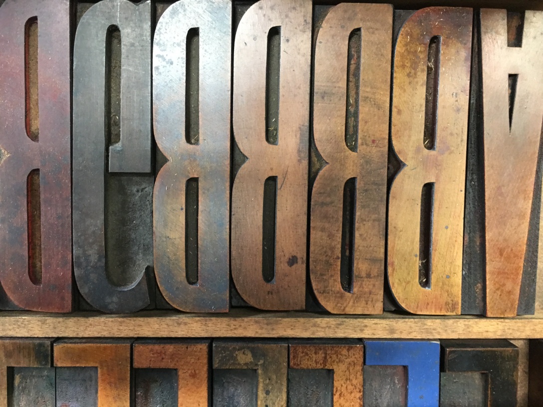
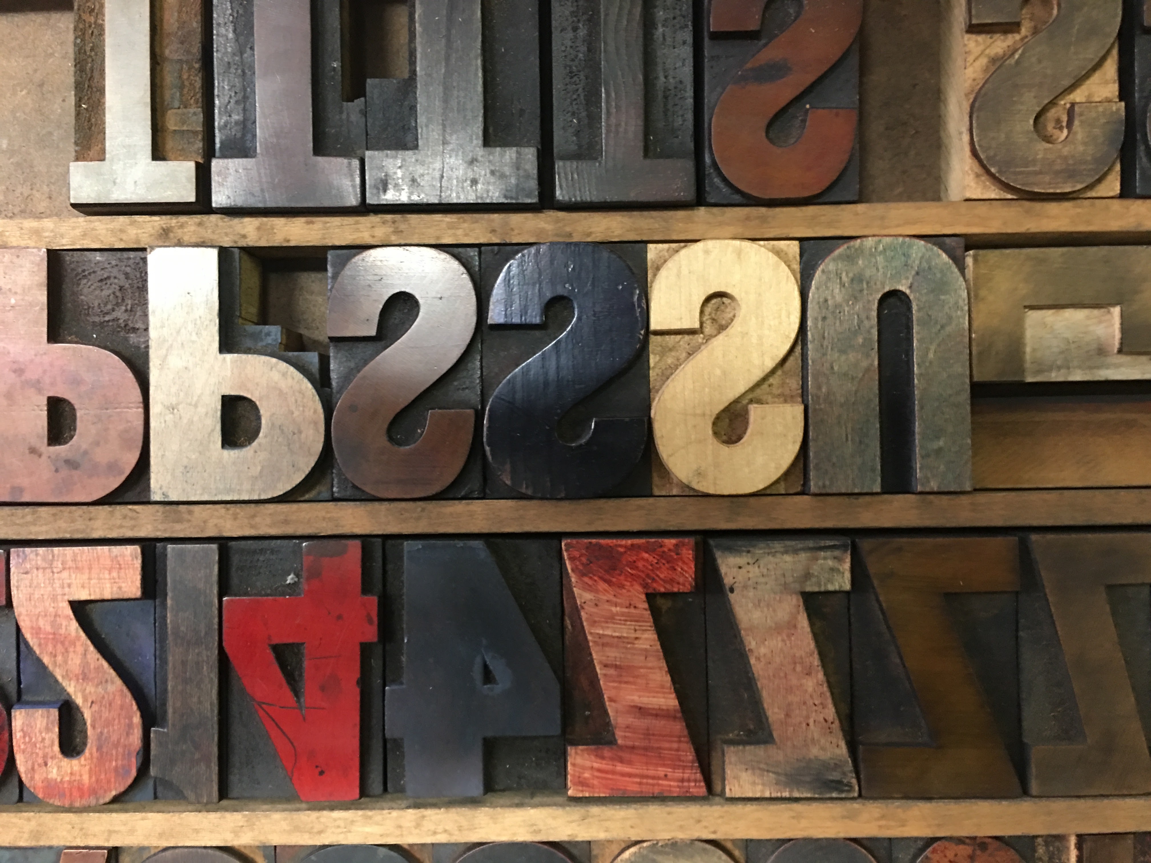
I took my week-long workshop at the Center for Book Arts in the Flatiron district of Manhattan, the same place I studied bookbinding back in the 20th century. The CBA has about ten old presses, six Vandercooks and a few other platen presses that look like Ben Franklin bought them second-hand. They also have dozens of cabinets filled with typefaces, each heavy drawer full of lead containing one face in one point size.
 So that’s the first lesson: unlike with a computer, real type only comes in a limited number of sizes and many of the faces may only exist in one size. You can’t just scroll through a bunch of fonts until you see something you like. You have to pick one face from a big ring binder of samples (and the samples don’t contain every letter, just the name of the face set in itself). Then you have to find the drawer with your typeface and that could be anywhere in the stacks of cabinets, each with a tiny label, arranged in no coherent order. Then you slide half open the drawer below the one you want to support your drawer (each drawer weights a helluva lot — it’s full of steel and lead after all), and pear uncomprehendingly at the little compartments containing each letter. Uncomprehendingly, because they are not laid out alphabetically or even according to QWERTY. You have to get a map to the drawer and these maps aren’t universal, so you have to pull out each letter one at a time, a letters that’s backwards and sometimes minuscule, then arrange it right to left on a stick.
This sort of nightmare is even more likely if you’re the sort of butterfingered, ten-thumber who has spend his whole life making wonky, ink-spattered things.
Next you have to decide how big the space should be between each word and locate the appropriate spacer. Then you put down some leading to separate the first line from the next, leading being a strip of lead which comes in different lengths and thickness. You determine the length by setting your longest line of copy and, if that line is in the middle of the page, you’ll need to measure it, then dismantle it so you can begin again with the first line of copy. You determine the thickness by deciding how much space you want between lines and how many lines you want on the page over all.
 Now, the ‘stick’ that you are arranging the letters on is just a little metal bracket with no adhesive or magnetic qualities. If you don’t hold it at the correct angle, the letters will topple over and may even slide off and end up in a jumble on the floor. This sort of nightmare is even more likely if you’re the sort of butterfingered, ten-thumber who has spend his whole life making wonky, ink-spattered things. Not naming names, just saying.
And that nightmare is compounded by the constant sense that the tools you are working with are not available on Amazon but are all artifacts from long-defunct manufacturers and if you screw anything up, you’ll be trashing part of our cultural history. No pressure, numbnuts.
There are also drawers full of even more magical objects: wooden type, some of it letters the size of my hand. They all bear a luminous patina from decades of ingrained ink, a rich sheen of mysterious layered color. These faces are often incomplete, missing letters, punctuations, that you need to compensate for with creative improvisation.
 Once you have your type picked and assembled, you lay it on the bed of the press, then surround it with strips and blocks of metal and wood called ‘furniture.’ These all need to be measured and arranged like Tetris till they fill in each direction of pressure. Finally, you slip in a quoin which is a sort of expanding strip with a hole in it which you tighten with a key.
[Printing is the source of so many common phrases. For example, “to quoin a phrase” comes from locking some words into a form. “Mind your ps and qs” refers to a common mistake in setting type where you mix up backwards letters in the form. “Wrong end of the stick” comes from arranging the letters the wrong way. “Upper-case” and “lower-case” describe where in the drawer of type (or case) each letter can be found. “Get the lead out” means get a move on and set the next line. There are scores of others.]
With furniture in place, you next have to make the final adjustments to the type lockdown. That requires tweezering increasingly thinner sheets of copper and brass between the letters so they won’t wobble or slide. Next you pick your inks. There are dozens of vibrant colors available, each in a can with a tight lid which you have to screwdriver open and then pray it isn’t dried up or contaminated. Then you scoop out a tablespoon or so onto a sheet of Plexiglass, stir it about with a putty knife and either apply it to the roller of the press or brayer it onto the type by hand.
You pray again (no wonder printing used to be done exclusively by monks) and examine your print.
Next you do some tests on newsprint which reveal all the adjustments you have yet to make. You discover letters that are backwards or upside down or the wrong face. You discover that one of your Gs is actually a C. You adjust kerning with more little strips. You realize the whole damned thing looks like hell and is the wrong typesize and have to wipe it all down and reset it. In between skirmishes, you have to wash your hands repeatedly with orange-scented pumice soap.
Finally, you are ready to print — oh, wait, not yet. First, you have to go to the store and buy paper (250+ gram weight) which comes in big sheets, usually 22″ x 30″. Then you have to determined the direction of the grain and how best to cut up the sheet to get the least waste. Then you go to the giant papercutter, a black steel guillotine with a foot pedal, and when you swing it up, try not to slice open the back of your head or sever many fingers.
Okay, now you’re ready. You start up the press, which activates the rollers. Then you make sure the press is in ‘trip mode’ and you ink the rollers (unless you brayered them by hand — don’t do both). Then you line up your paper, make sure it’s gripped by at least three points of contact, then hold the paper down on the platen while you turn the crank and walk down the length of press then catch the print as it comes up from the depths, pull it out with one hand, while rolling the mechanism back to the starting point. You pray again (no wonder printing used to be done exclusively by monks) and examine your print. If all went well, you put it on the drying rack and print again.
So far, so good. Now the trickiest part which is registering the second color. You have to clean and take apart all the type you have on the press and slip in whatever you wanted printed in the second color. You also need to do this if you combined wood and metal type because they are slightly different heights on off the bed). If you were organized and took your time, you kept all the furniture in the same order as you rebuilt the form, so the registration should work fairly well. Or, if you’re me, you’ll have to do a dozen alterations and adjustments and waste most of your test prints in the process.
Then you have an edition of prints and have to figure out what you will do with them. Mine will probably end up in a drawer but the lessons they revealed will stick with me.
First, after five decades of making things, from books to model planes to shirts to Ikea furniture, I remain a super-consistently hasty slob. Clearly, I can’t change.
Two: I like making stuff with my hands, even if it’s slower and shittier than doing it on a computer. I like the physicality, even the back-breaking parts, and all the many serendipities that happen with analog production, the mistakes that occur and the ingenuity needed to correct or compensate for them. I like the beauty of the brass rollers, the copper slivers you slip between letters, the burnished old wood type, the lumpy mouths of the ink pots.
Three: I like the historical thread that weaves through the press. The awareness that each of these bits of type was handled by generations of people before me, that the processes I’m working on are fairly unchanged back to Guttenberg.
This year, I learned a teeny bit about hockey, botany, canine dentistry, constitutional law, shark migration, and a loads of other inessential but fascinating things.
Four: I like to appreciate how hard it can be to make something well, how that appreciation of craftsmanship is is lost when I can just open InDesign, click my mouse and and push ‘Print.’
Five: I liked the vacation from so much of my usual days, sitting at this desk in front of this computer, the world of digital creation with its endless options, easy undos, and immediate gratifications. I spent a lot of this summer on another project —learning how to go from drawing in ink on paper to making art on an iPad. An exploration in the opposite direction with its own frustrations and satisfactions.
Six: I had to break free of the aesthetics and conventions of digital design. Initially, I was struggling with the design and concept of my letterpress project and then I realized why. I (and frankly many of my classmates) were creating designs that frankly could have just as well been made (and better) with a computer. When I realized this, I decided to use the medium for what it is, to make something I couldn’t make with a computer or a pen, something that was quintessentially an analog print. I drew my inspiration from circus posters and wild postings, chunky, loud, oversized, with rich colors my Epson couldn’t dream of.
Seven: I like learning something new. So much of this week was mystifying, and much remains cloudy, but it was also filled with revelations. And even though I am not good at printing, I can see how, with time, I could be. I don’t know that I want or need to be good at this, but, from completely opacity, I have discovered a path and it is nice to know I could follow it if I chose rather than being afraid or overwhelmed by my ignorance. I’m not a native, but at least I know the basic language now and can find my way about with a map.
It’s important to me, as a creative person and as a human in this world, to periodically shake up my assumptions and learn something, anything new. To understand a bit about things I like or things I am completely oblivious to. This year, I learned a teeny bit about hockey, botany, canine dentistry, constitutional law, shark migration, and a loads of other inessential but fascinating things.
After last week, I am a jack of yet one more trade.

Great post! My fascination with letters and words always seems to find its way into my collages and my work with textiles. Truly enjoyed this writing today – thank you.
Kristin
LikeLiked by 1 person
So your creativity and love of books started when you were a young pup. Not surprised. Inspired by your writing to continue to learn something new as we age. It’s never to late to get messy and enjoy the process. Thanks to you and sketchbook skool, I filled an entire sketchbook on vacation – drew every day.
LikeLike
I LOVED reading all this info… and info on the link also.
My husband used to be a typesetter for a newspaper when every letter was set by hand (in the olden days). He was really good. Even now he can find a ‘typo’ on ANY page without reading the page. Definitely a lost skill.
LikeLiked by 1 person
I love typesetting but for now I get great pleasure in learning biikbinding and producing my own sketchbooks as well as notebooks for gifts.
LikeLike
Great blog and so interesting to read your reflections on having to work analog. I was having a similar conversation with my husband today. I’m working on a sketchbook for The Sketchbook Project and was telling him how much I’m learning from having to solve problems when sketches go wrong because I know I’m sending the whole sketchbook away – normally if I make a serious error I upload the sketch to my iPad and fix it digitally before I share it online.
I’ve never done any typesetting but one of my favourite things to browse flea markets for is old print blocks and I have quite a few – there is something so evocative about them. A week print setting sounds like my idea of heaven.
LikeLike
I played “library” when i was little, too. I had a tiny toy printing press that never worked correctly but, man, do I wish I still had it! Thanks for the burst of memories!
LikeLiked by 1 person
I missed the book club this week but this post more than makes up for it. Thank you Danny.
LikeLike
It is not suprising then that the two book binders I know of choose to live off the grid. Thank you for this fascinating story.
LikeLike
Oh my gosh Danny, thank you so much for this wonderful post. Your description of typesetting really brought it to life for me! My grandfather was a cartoonist and typesetter and your story brought me a little closer to a man I never had the opportunity to meet. Thank you!
LikeLike
great post. when I was in elementary school (half a century ago) I took a semester of Graphic Arts, we silk-screened tee shirts, make rubber stamps with our name, and even set type and printed on a small ink printing press. The experience as a child has stayed with me my whole life.
LikeLike
And you got to use that nice Vandercook. Jealous.
LikeLike
[…] The next big influence on my iPad exploratory was a tech innovation from centuries ago: moveable type. In Mid July, I took a week-long workshop in letterpress printing at the Center for Book Arts and it was quite profound. I wrote about it soon thereafter. […]
LikeLike