
When I first landed in America, everything was overwhelming and new and deluxe. Even a 29¢ pen had the power to impress me mightily.
Category: Other projects
My Life in Pens- Pt. 3 Cross
A sacred memory from the Holy Land. Another heart-wrenching chapter in my endless journey towards manhood.
My Life in Pens: Pt. 2 — Ballograf
Another gripping episode about my early years. Abused, ignored, mistreated. Me. And my writing tools.
My Life in Pens: Pt. 1 – Parker
There’s a line running through my life — a line drawn by a handful of different pens. I will trace that line in a series of short films to be released episodically, starting today. I hope you enjoy “My Life in Pens”.
Letter-pressed.
When I was about six, I started making books. There were so many aspects of bookmaking that intrigued me and I wanted to make them mine.
My first books were stories, with a drawing filling the left page, words filling the right. I made them with crayons and pencils, writing as neatly as I could.
At ten, I wrote a book on dogs, with drawings listing the different breeds. I had sections on dog care, and took photos of my long-suffering dog Pogo to demonstrate how to clean her ears with cotton balls and how her teeth were laid out in her long snout. When they came back from the photo lab, I pasted the pictures into my binder and wrote captions in italics beneath each one. Fig.I. Fig IIa, etc.
Throughout my childhood and adolescence, I wrote diaries, plays, short stories, novellas, and was fetishistic about the manuscripts, making carbon-paper copies, putting each one into a file folder or a plastic sleeve , then archiving them in cardboard boxes or ring binders.
I had my own library, with a card catalog I carefully typed onto index cards, scotch-taped Dewey decimal labels on each spine, and checkout cards in little sleeves on the final endpapers to record who had borrowed each one. I re-arranged my books by height, by color, by author, subject, date of publication, publisher.
He taught me the correct place for an author sign a book, not on the end paper but on the half-title or title page.
My mother sort of understood it. None of my friends did. But for me, there was something very comforting in making books, even if they were lopsided, incomplete, lumpy with glue and typos.
My uncle was very authorial — he had a beard, a Selectric, smoked a pipe, played Schubert lieder. A shelf in his library held his six books in a row, his name on each spine, his author photo on each flyleaf. He taught me the correct place for an author sign a book, not on the end paper but on the half-title or title page.
In high school, I worked on the newspaper and saw my name and words in print for the first time. I have vivid recall of what each article looked like — the number of columns, the placement of the illustration, the size of my byline. I took home stacks of each issue and added them to my archive.
My undergraduate thesis was the first properly bound book I produced, three hundred or so pages on the power of group psychology of student radicals in the 1960s. It was a manuscript bound in plain white cardboard with a black taped spine and a typed label on the cover but, to me, it was a real book and I have it still.
In my mid-twenties, desktop publishing became commonplace and I delighted in setting pages of type, making faux-newspaper layouts, printing out little booklets all written, designed, and printed by me. It was a thrill to see anything I wanted set in type in columns and pages.Then I got access to a scanner and I could make images and wrap text around them. I loved the ker-chunk and thwack of pages extruding from a laser printer, crisp and sharp. I printed out booklets and faux newspaper articles for my family, then my girlfriend, then my wife.
 Twenty years ago, I took some courses in bookbinding. There was something so magical about making a case-bound book. Sure, I’d made pamphlets, center stapling the pages together, and filled ring binders with loose-leaf paper, but they weren’t real books. A real book had a spine and pages that were sewn in. But on my own, I could never figure out how to make one, how it all stayed together in a neat box with a rigid spine. Soon the secrets were revealed and I cranked out perfect-bound sketchbooks. Perfect-bound, yes, but not perfectly bound. My bindings were, like everything I make, wonky, ink-stained, lumpy with adhesive, far from perfect, mine.
A couple of years later, my first book was published and soon, I too had a shelf with a row of spines with my name upon them. I would spot them in bookstores and libraries or being read by strangers on a train. In time, as my publisher sent paperback editions and stacks of foreign editions, my books became more commonplace but they are never ho-hum. They are my books.
This last week, I finally wandered into the one uncharted territory left in my book-making realm: the actual printing of words. My sister is a commercial printer and I’d been on press before when I worked in advertising, watching ads and brochures roll of big industrial presses, but I’d never been involved in the actual setup, especially not in a pre-digital way, so this was very exciting — and scary.
It was another area half-filled with shadow. I had a vague sense of many parts of the process: that type was set, that it was put on a press, that ink came off rollers, that blank sheets slipped in one end and pages came out the other, but I knew I didn’t know the half of it. Actually the quarter of it. Maybe even a smaller fraction.
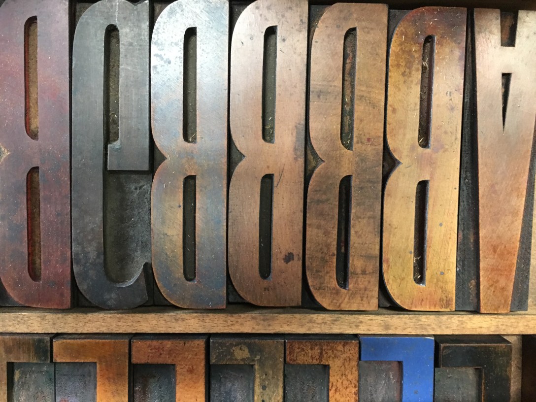
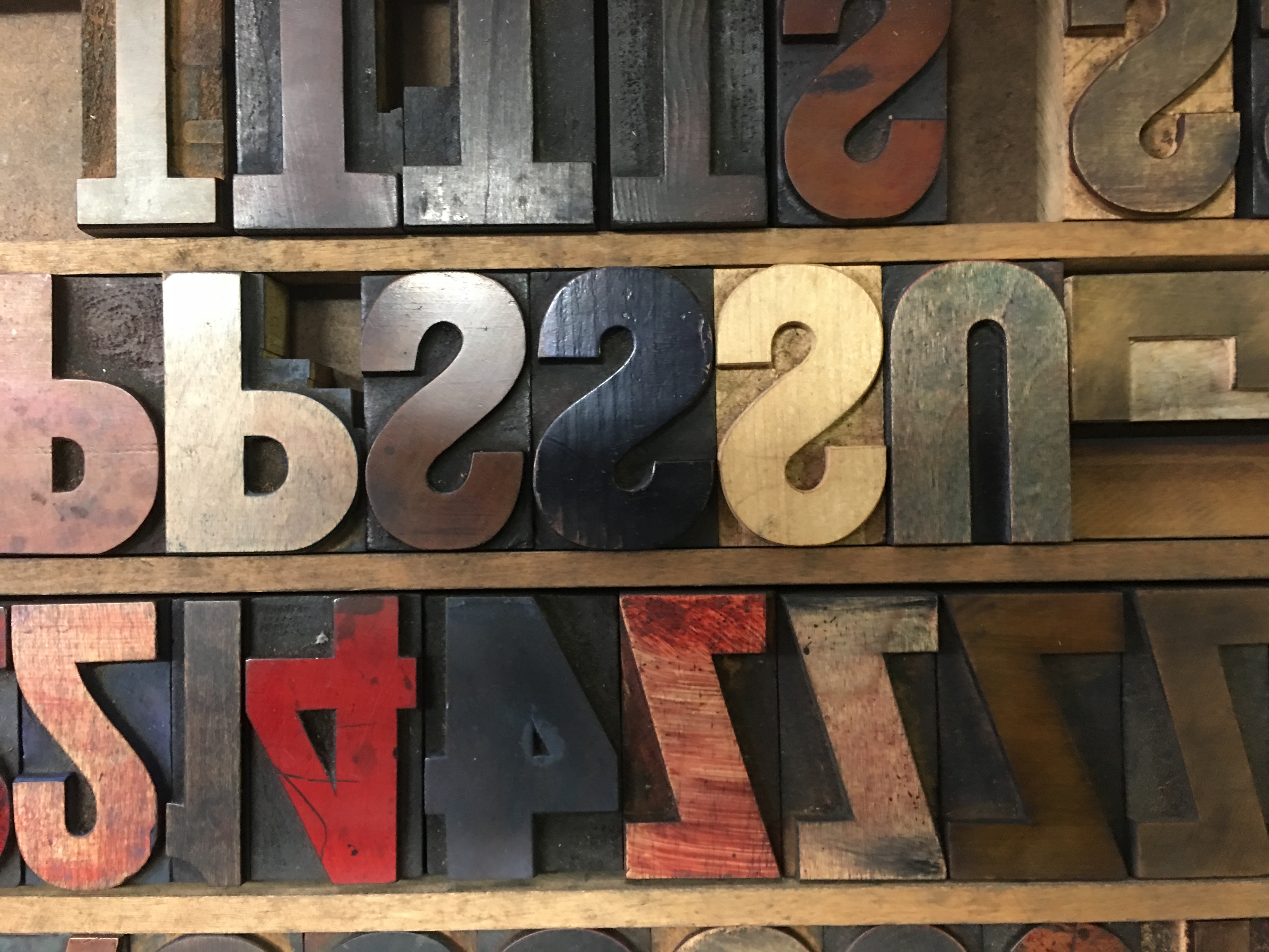
I took my week-long workshop at the Center for Book Arts in the Flatiron district of Manhattan, the same place I studied bookbinding back in the 20th century. The CBA has about ten old presses, six Vandercooks and a few other platen presses that look like Ben Franklin bought them second-hand. They also have dozens of cabinets filled with typefaces, each heavy drawer full of lead containing one face in one point size.
 So that’s the first lesson: unlike with a computer, real type only comes in a limited number of sizes and many of the faces may only exist in one size. You can’t just scroll through a bunch of fonts until you see something you like. You have to pick one face from a big ring binder of samples (and the samples don’t contain every letter, just the name of the face set in itself). Then you have to find the drawer with your typeface and that could be anywhere in the stacks of cabinets, each with a tiny label, arranged in no coherent order. Then you slide half open the drawer below the one you want to support your drawer (each drawer weights a helluva lot — it’s full of steel and lead after all), and pear uncomprehendingly at the little compartments containing each letter. Uncomprehendingly, because they are not laid out alphabetically or even according to QWERTY. You have to get a map to the drawer and these maps aren’t universal, so you have to pull out each letter one at a time, a letters that’s backwards and sometimes minuscule, then arrange it right to left on a stick.
This sort of nightmare is even more likely if you’re the sort of butterfingered, ten-thumber who has spend his whole life making wonky, ink-spattered things.
Next you have to decide how big the space should be between each word and locate the appropriate spacer. Then you put down some leading to separate the first line from the next, leading being a strip of lead which comes in different lengths and thickness. You determine the length by setting your longest line of copy and, if that line is in the middle of the page, you’ll need to measure it, then dismantle it so you can begin again with the first line of copy. You determine the thickness by deciding how much space you want between lines and how many lines you want on the page over all.
 Now, the ‘stick’ that you are arranging the letters on is just a little metal bracket with no adhesive or magnetic qualities. If you don’t hold it at the correct angle, the letters will topple over and may even slide off and end up in a jumble on the floor. This sort of nightmare is even more likely if you’re the sort of butterfingered, ten-thumber who has spend his whole life making wonky, ink-spattered things. Not naming names, just saying.
And that nightmare is compounded by the constant sense that the tools you are working with are not available on Amazon but are all artifacts from long-defunct manufacturers and if you screw anything up, you’ll be trashing part of our cultural history. No pressure, numbnuts.
There are also drawers full of even more magical objects: wooden type, some of it letters the size of my hand. They all bear a luminous patina from decades of ingrained ink, a rich sheen of mysterious layered color. These faces are often incomplete, missing letters, punctuations, that you need to compensate for with creative improvisation.
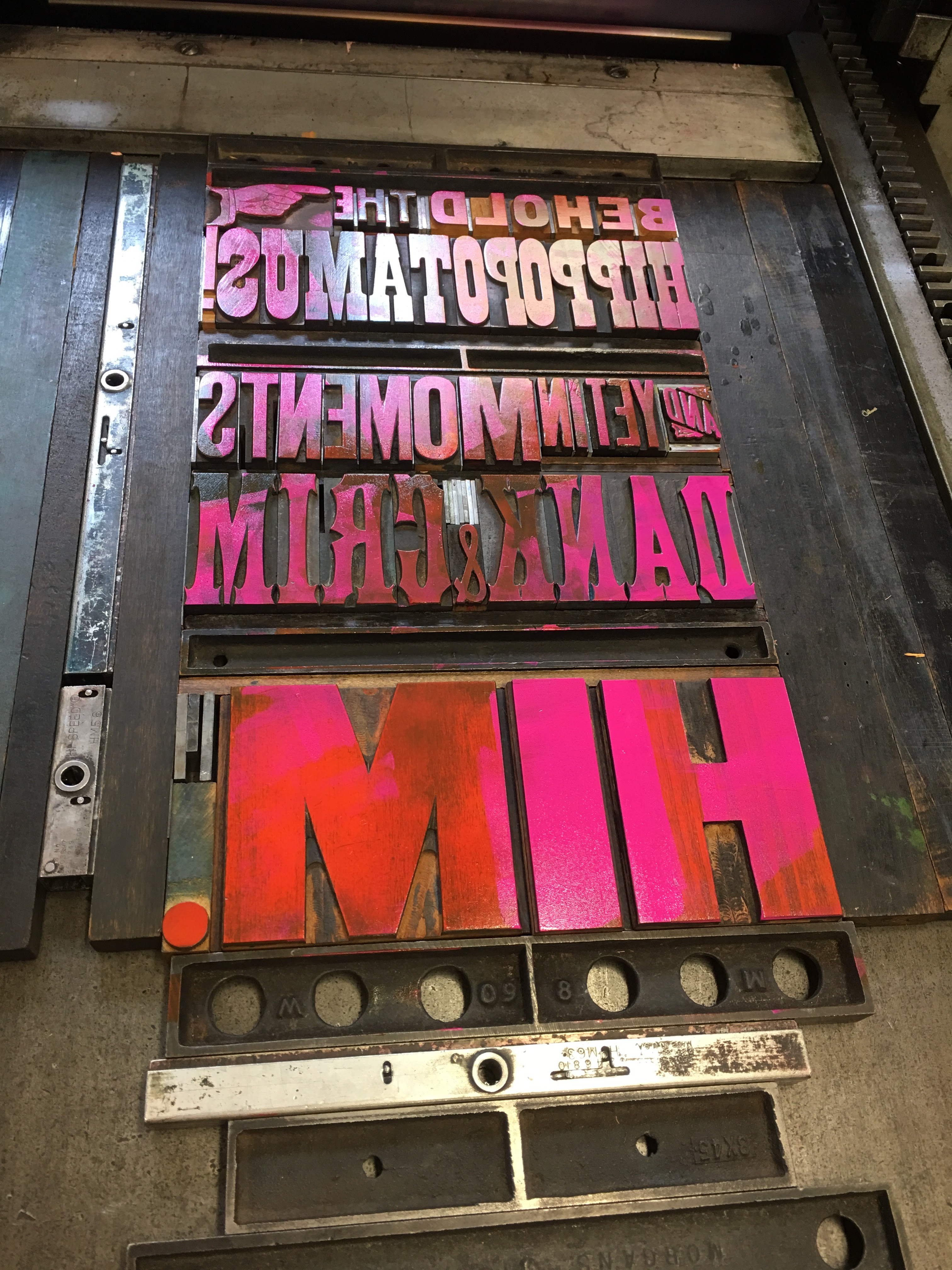 Once you have your type picked and assembled, you lay it on the bed of the press, then surround it with strips and blocks of metal and wood called ‘furniture.’ These all need to be measured and arranged like Tetris till they fill in each direction of pressure. Finally, you slip in a quoin which is a sort of expanding strip with a hole in it which you tighten with a key.
[Printing is the source of so many common phrases. For example, “to quoin a phrase” comes from locking some words into a form. “Mind your ps and qs” refers to a common mistake in setting type where you mix up backwards letters in the form. “Wrong end of the stick” comes from arranging the letters the wrong way. “Upper-case” and “lower-case” describe where in the drawer of type (or case) each letter can be found. “Get the lead out” means get a move on and set the next line. There are scores of others.]
With furniture in place, you next have to make the final adjustments to the type lockdown. That requires tweezering increasingly thinner sheets of copper and brass between the letters so they won’t wobble or slide. Next you pick your inks. There are dozens of vibrant colors available, each in a can with a tight lid which you have to screwdriver open and then pray it isn’t dried up or contaminated. Then you scoop out a tablespoon or so onto a sheet of Plexiglass, stir it about with a putty knife and either apply it to the roller of the press or brayer it onto the type by hand.
You pray again (no wonder printing used to be done exclusively by monks) and examine your print.
Next you do some tests on newsprint which reveal all the adjustments you have yet to make. You discover letters that are backwards or upside down or the wrong face. You discover that one of your Gs is actually a C. You adjust kerning with more little strips. You realize the whole damned thing looks like hell and is the wrong typesize and have to wipe it all down and reset it. In between skirmishes, you have to wash your hands repeatedly with orange-scented pumice soap.
Finally, you are ready to print — oh, wait, not yet. First, you have to go to the store and buy paper (250+ gram weight) which comes in big sheets, usually 22″ x 30″. Then you have to determined the direction of the grain and how best to cut up the sheet to get the least waste. Then you go to the giant papercutter, a black steel guillotine with a foot pedal, and when you swing it up, try not to slice open the back of your head or sever many fingers.
Okay, now you’re ready. You start up the press, which activates the rollers. Then you make sure the press is in ‘trip mode’ and you ink the rollers (unless you brayered them by hand — don’t do both). Then you line up your paper, make sure it’s gripped by at least three points of contact, then hold the paper down on the platen while you turn the crank and walk down the length of press then catch the print as it comes up from the depths, pull it out with one hand, while rolling the mechanism back to the starting point. You pray again (no wonder printing used to be done exclusively by monks) and examine your print. If all went well, you put it on the drying rack and print again.
So far, so good. Now the trickiest part which is registering the second color. You have to clean and take apart all the type you have on the press and slip in whatever you wanted printed in the second color. You also need to do this if you combined wood and metal type because they are slightly different heights on off the bed). If you were organized and took your time, you kept all the furniture in the same order as you rebuilt the form, so the registration should work fairly well. Or, if you’re me, you’ll have to do a dozen alterations and adjustments and waste most of your test prints in the process.
Then you have an edition of prints and have to figure out what you will do with them. Mine will probably end up in a drawer but the lessons they revealed will stick with me.
First, after five decades of making things, from books to model planes to shirts to Ikea furniture, I remain a super-consistently hasty slob. Clearly, I can’t change.
Two: I like making stuff with my hands, even if it’s slower and shittier than doing it on a computer. I like the physicality, even the back-breaking parts, and all the many serendipities that happen with analog production, the mistakes that occur and the ingenuity needed to correct or compensate for them. I like the beauty of the brass rollers, the copper slivers you slip between letters, the burnished old wood type, the lumpy mouths of the ink pots.
Three: I like the historical thread that weaves through the press. The awareness that each of these bits of type was handled by generations of people before me, that the processes I’m working on are fairly unchanged back to Guttenberg.
This year, I learned a teeny bit about hockey, botany, canine dentistry, constitutional law, shark migration, and a loads of other inessential but fascinating things.
Four: I like to appreciate how hard it can be to make something well, how that appreciation of craftsmanship is is lost when I can just open InDesign, click my mouse and and push ‘Print.’
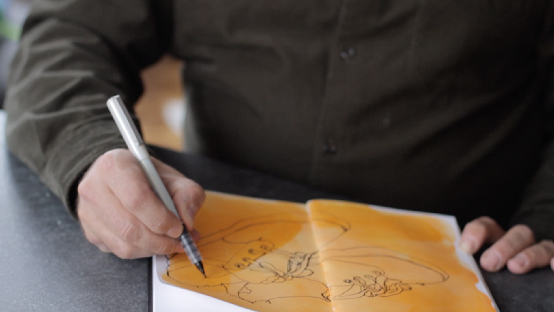
Five: I liked the vacation from so much of my usual days, sitting at this desk in front of this computer, the world of digital creation with its endless options, easy undos, and immediate gratifications. I spent a lot of this summer on another project —learning how to go from drawing in ink on paper to making art on an iPad. An exploration in the opposite direction with its own frustrations and satisfactions.
Six: I had to break free of the aesthetics and conventions of digital design. Initially, I was struggling with the design and concept of my letterpress project and then I realized why. I (and frankly many of my classmates) were creating designs that frankly could have just as well been made (and better) with a computer. When I realized this, I decided to use the medium for what it is, to make something I couldn’t make with a computer or a pen, something that was quintessentially an analog print. I drew my inspiration from circus posters and wild postings, chunky, loud, oversized, with rich colors my Epson couldn’t dream of.
Seven: I like learning something new. So much of this week was mystifying, and much remains cloudy, but it was also filled with revelations. And even though I am not good at printing, I can see how, with time, I could be. I don’t know that I want or need to be good at this, but, from completely opacity, I have discovered a path and it is nice to know I could follow it if I chose rather than being afraid or overwhelmed by my ignorance. I’m not a native, but at least I know the basic language now and can find my way about with a map.
It’s important to me, as a creative person and as a human in this world, to periodically shake up my assumptions and learn something, anything new. To understand a bit about things I like or things I am completely oblivious to. This year, I learned a teeny bit about hockey, botany, canine dentistry, constitutional law, shark migration, and a loads of other inessential but fascinating things.
After last week, I am a jack of yet one more trade.
My bastard blog
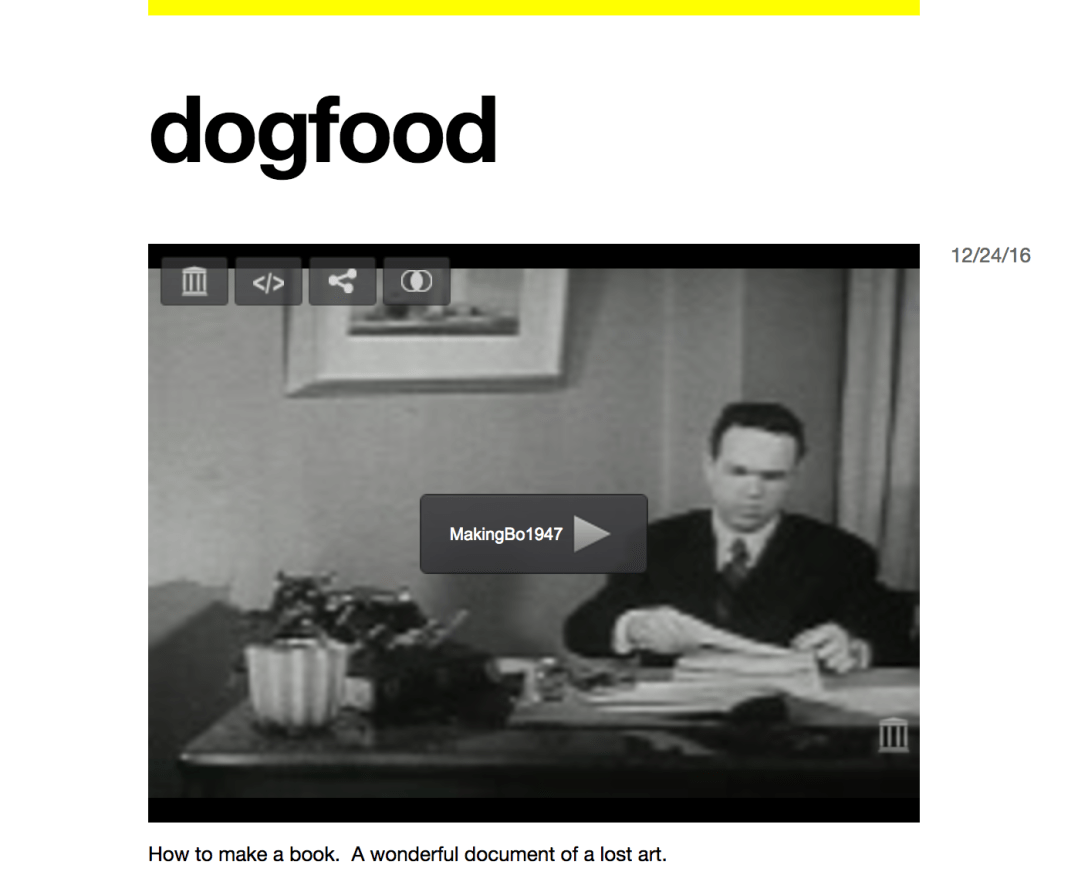
I am restoking my commonplace book, dogfood. It’s a tumblr blog I started ages ago so I’d have a place to just dump stuff I liked so I could come back and find inspiration when I need it.
Much of it consists of photos I take of cool stuff, but I think I’m going to start using it for writing stuff too, to collect all the ideas and quotes and factoids I glean here and there and have just been storing in my private Evernote notebooks. Most of it will appeal mainly to me but who knows, some of it might spark you too.
I’m adding the feed to the right hand column of this blog too, so you can see the latest when you come here.
The URL is dannybaba.tumblr.com/. Danny baba is what our servants called me when I was a kid and lived with my grandparents in Pakistan. My grandmother used to sing me a lullaby in Urdu that went:
Ninny, baba, ninny.
Makan roti chini
Makan roti hogyah
Danny baba sogyah.
As a result, I called my grandmother “Ninny.”
Anyway, this may reinvigorate my desire to write and share stuff on the Internet again. I have entered this phase of late where I am doing stuff but am not sure what to share of it. As result, whenever I think of posting, I’m not sure if I can manage to craft it into something worth your while.
I also keep hearing about the death of the blog, which I actually find rather exciting. I started this blog 13 years ago, essentially to share jokes with my old pal Richard Bell, and never imagined it would become what it had over the decades. Maybe if I scale it back to just a bunch of jokes and discoveries rather than portentous, ponderous polemics designed to change the world, I and the world will be better off. Maybe that will be my resolution for 2017.
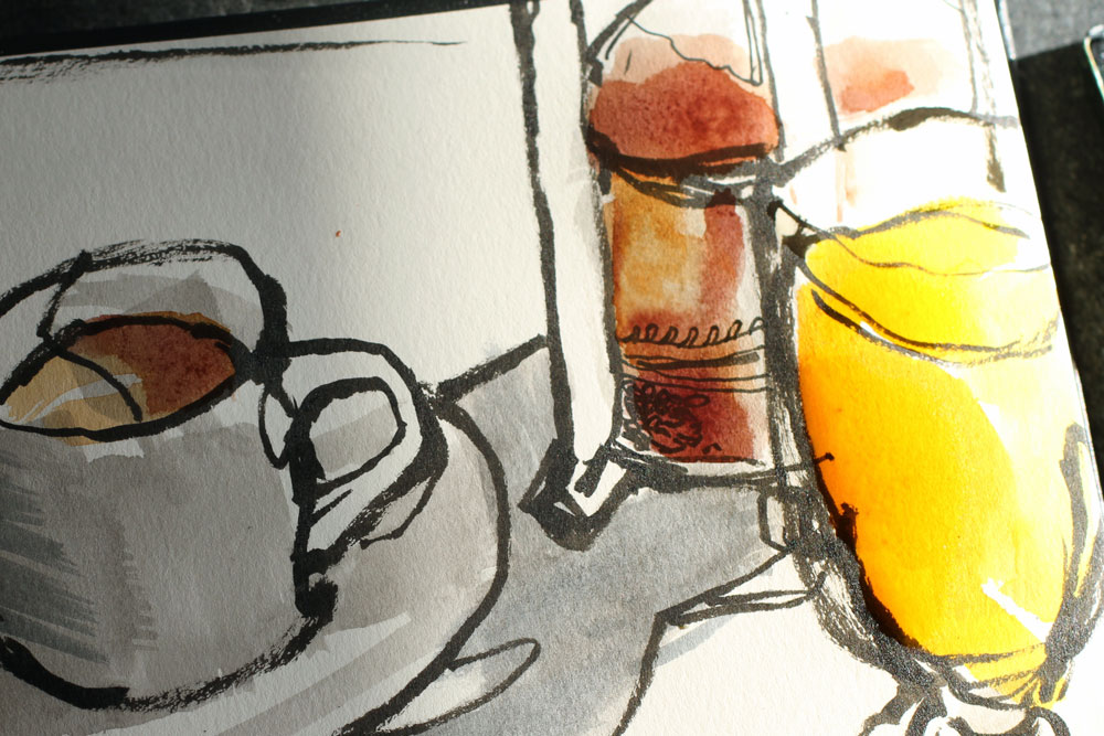
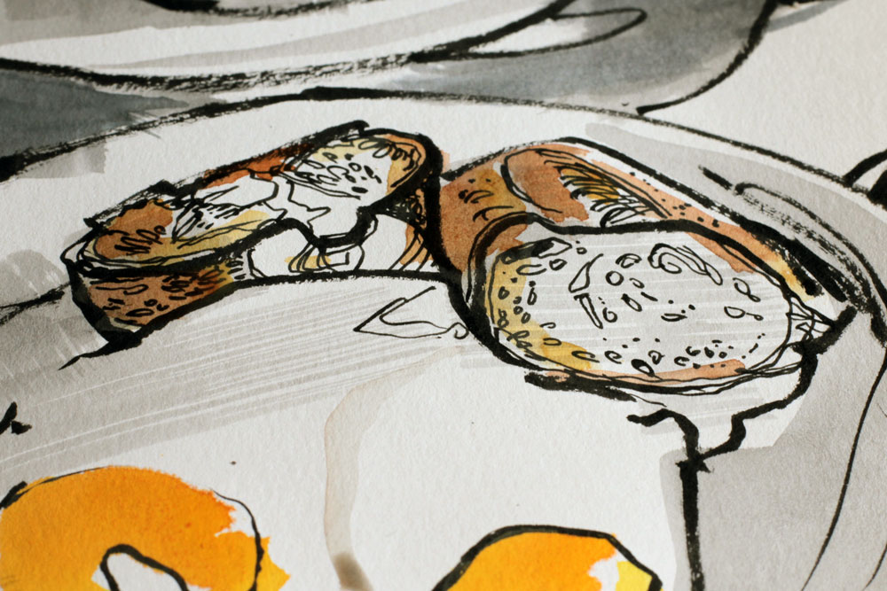
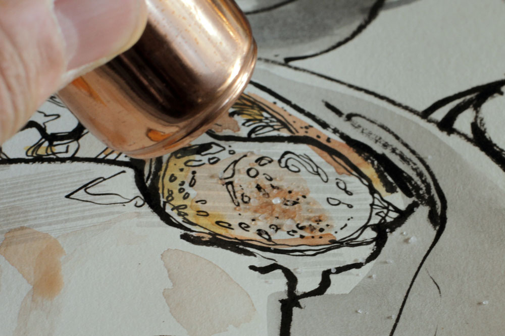
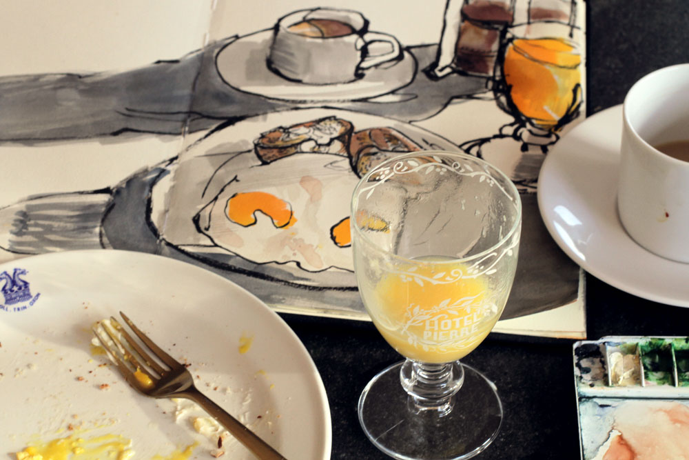
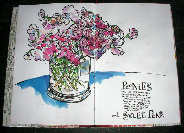
How I make art before I make coffee.

Recently I was invited to participate in a lovely series called “The Original” Documented Life Project™”. Guest artists are asked to document their process in making a piece. I was emailed the following assignment:
“The theme for this month is ‘MAKING YOUR MARK (DOODLES & MARK MAKING). The art challenge for this week is ‘AS A FOCAL POINT’, and the prompt is ‘COMING INTO FOCUS”
I’m not always awfully good at following assignments so I just sort of did what I do. I hope they like it.


* I love Kevin’s latest.
What rhymes with “Danny’s drawings?”
Bits and bobs
Maybe it’s ’cause it’s Spring, but so many things are blossoming in my life these days.
Spring: Our Sketchbook Film called “Spring” was just on the big screen at TELUS S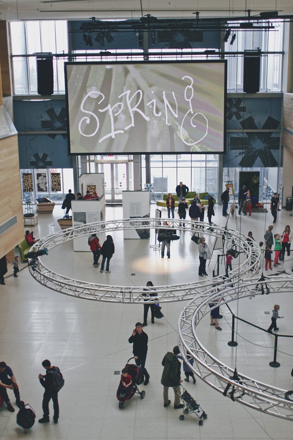 park, the new Science Centre, in Calgary, Canada. People liked it, they tell me. It seems a zillion springs ago that I sat in the park drawing for that film. This year the spring in New York seems far grimmer and my sister texted me from the train platform this morning to tell me it was cold and raining and she was over it. I didn’t mention that our car thermometer registered 97˙ yesterday in an LA parking lot. I’m a nice brother.
Fullerton: I am going to be giving my first talk in California next week at Fullerton
 College. I will be talking about my life, my discovery of illustrated journaling and all the things it has taught me over the years. I’ll also be showing loads of images from my books. It’s open to the public and free, so if you are in the area, please drop by and say hi. It’ll be nice to just drive to one of my talks, rather than have to fly around the world. Well, I like doing that too.
HOW in Boston: I am giving a big presentation at the HOW Design Live conference in a few weeks. I’ll be talking about some thing brand-new for me, the inner critic, based on posts I wrote here on my blog. They’ve asked me to do the speech twice so I will be spending the whole week in Boston.  It’s been loads of fun, writing and designing a new talk, but I must say the monkey does not like being talked about and I have had to wrestle with him daily. Now the speech has really started to come together and I am feeling great about it and I really look forward to seeing all the designers who will be there. Not to mention Seth Godin, Malcolm Gladwell and Stefan Sagmeister.
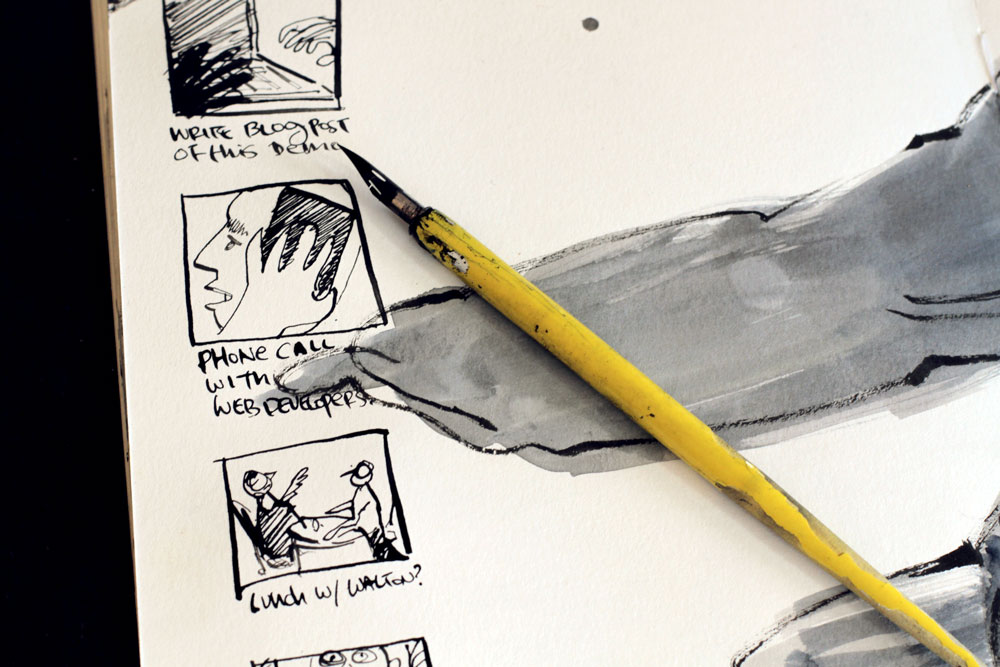
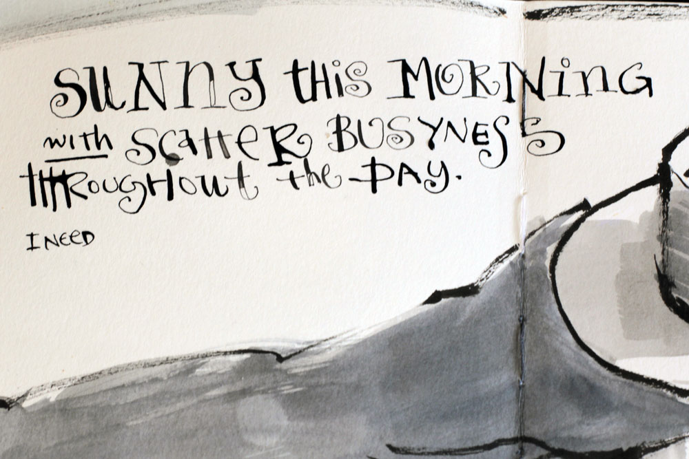
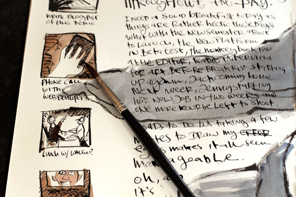
art Before Breakfast: My new book ![]() is all written, illustrated and designed and is now with my publishers. I just reviewed the galleys and it looks awesome. I am so excited about this one. I hope it will have the same sort of impact that “The Creative License” had and help a lot of people to find the time and inclination to make art part of the their lives. Plus it has several hundred new drawings and paintings and is quite handsome.
is all written, illustrated and designed and is now with my publishers. I just reviewed the galleys and it looks awesome. I am so excited about this one. I hope it will have the same sort of impact that “The Creative License” had and help a lot of people to find the time and inclination to make art part of the their lives. Plus it has several hundred new drawings and paintings and is quite handsome. 
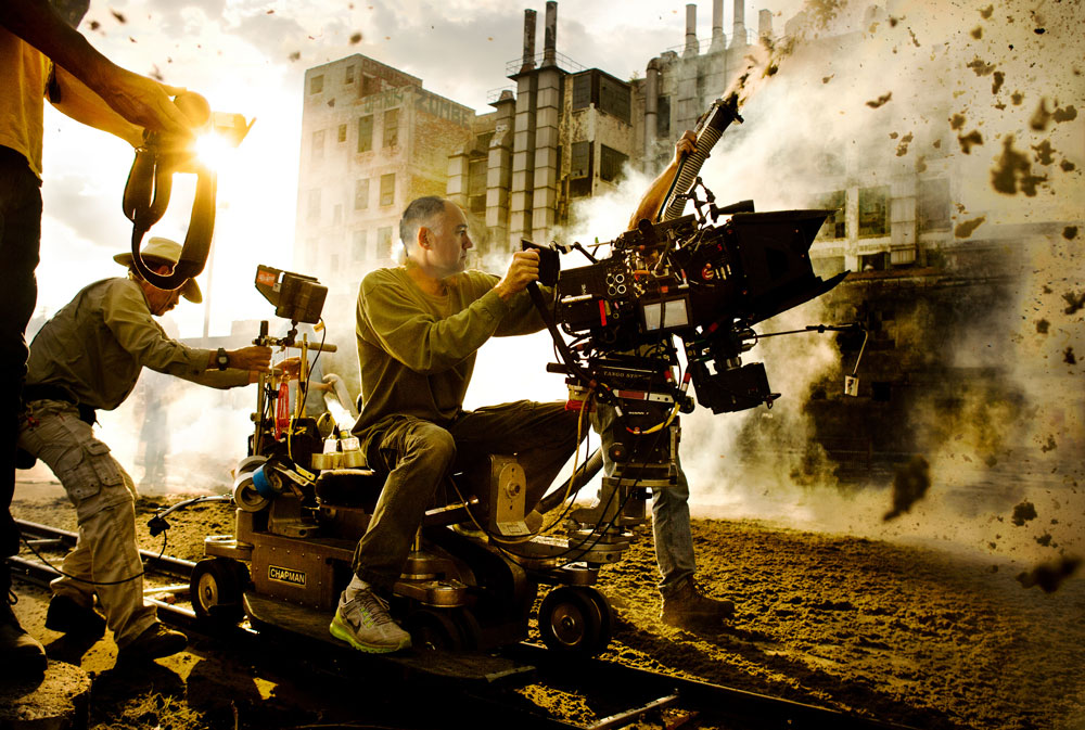
Sketchbook Skool: Our online school is humming along. We had to cap the first klass at 2,000 students and those who couldn’t get in the door have already been signing up for when we repeat the next semester. We are well into production on the next Kourse. It’s called “Seeing” and our fakulty includes some real super stars: Cathy Johnson, Liz Steel, Brenda Swenson and Andrea Joseph. It launches on July 4th. We are doing even more elaborate and polished productions this semester and using professional video crews. I supervised Brenda’s shoot in Pasadena last week and tomorrow Liz shoots in Sydney with a director I found for her. Then Andrea will be joining Koosje in Amsterdam to shoot her klass. It’s all very international and exciting and I am now a producer, writer, artist, teacher, director, headmaster, entrepreneur, and fanboy. Koosje and I will also be teaching this and every term and I am really excited about the videos I’ll be making for my section.
Phew! Next I have to come back to New York to hang out with Jack for the summer. His term ends in a few weeks and then he begins a really exciting internship program working with some amazing painters and becoming part of the New York art scene. I am so proud of him and just know he will have a wonderful life making art. I have had such an amazing year. To think that twelve months ago, I was sitting in a meeting discussing marketing challenges for the oil industry!
In production.
Teaching used to be a fairly simple business. You get some chalk, a dunce cap, a book with all the answers at the back and you’re in business. In 2014, it seems to be a little more complex.


When I first started thinking about doing online classes, I wanted to make sure they were as exciting and interesting as possible. So, being me and living a couple of miles from Hollywood, I immediately started to go overboard. I started to talk to my friends, many of whom you know and who are among the best sketchbook artists in the world. We decided that it wasn’t enough to just slap together some recycled lessons, a couple of PDFs and some poorly lit snapshots. We wanted to make sumptuous, hilarious, inspirational, instructional films that would get you so fired up you’d have to start drawing night and day. Our inspiration was first of all, Bob Ross, then the Cooking Channel, then National Geographic, and now we’re thinking Spielberg and Peter Jackson.

So while everyone else was drinking eggnog, we have been deep into production.
Tommy and I spent several days in the depths of Brooklyn in production on his klass. Then we turned around and finished up filming my workshop. Meanwhile, Prashant is heading to India to rendezvous with a production team that will capture his insights about watercolors. Koosje is setting up lights and camera in Amsterdam.
Deep in a Minnesota snow bank, Roz is furiously pecking out epic scripts about paper and pens. And next week, I’ll be heading to San Diego to collaborate with Jane on her films.
Meanwhile, an elite team of even more amazing teachers are arrayed around the world, beavering away on the next wave of klasses. More on them soon.
If you want to know more about all of this flurry of activity when it is ready to launch, do sign up for our mailing list. Meanwhile, scrape together your pennies and polish your 3D glasses.
Happy New Year!


