How to make learning to draw a whole lot easier.

Why do you want to start drawing?

Wait, let me rephrase that — you probably don’t want to start drawing. You want to be be really good at drawing.
To pick up a pen, grab some paper, and effortlessly draw anything, perfectly, beautifully, dazzling your friends and confounding your enemies. You want to be the next daVinci, to knock out portraits indistinguishable from photographs, to replace your vacation snapshots with breathtaking watercolors, to have gallerists, collectors and reviewers clamoring outside the doors of your sunswept Tuscan studio.  And you have to start somewhere.

But deep down, you fear that you’ll never get to be great. It’ll be too hard, you’ll just give up, and instead of pride, you’ll be besieged by self-recrimination. Your dust-covered sketchbook will be just one more reminder of your failed attempts to achieve your dreams.

It doesn’t have to be that way. Seriously. Here’s how I know. I’ve been helping folks to start drawing for ages but more importantly, I have helped myself to start drawingAnd by teaching myself, I have learned a few things that could help you to get past those first few challenging steps. So this story is less about drawing techniques than it is how to incorporate drawing into your life, how to keep yourself motivated, and how to learn to learn.

How to accurately measure progress: So many fledgling artists focus on the horizon, then trip over their own feet and fall flat. They began by focussing on the end result of learning, that perfect drawing, then despair when each line they make fails to achieve that goal. What they are overlooking are all the individual steps they are making towards that objective, the small but crucial  improvements they are making every day. I know this because it happened to me too. Early on, I’d flip through my first handful of pages and grimace. They all sucked. I sucked. And I’d never get any better.

But, had I been paying attention, had I been willing to be objective instead of brutally critical, I would have noticed how much actual progress I’d been making. That my lines were more confident. That I’d tackled complex new subjects. That I was starting to see how to really see. When I look back on my early sketchbooks now, I can see that, even after a month or two, I was getting better and better. But at the time, all I could think was: “I will never get there.”
Why? Because instead of comparing me with me, I was comparing me with da Vinci, with my friend the professional illustrator, with all the artists who’d inspired me to want to start to draw. The first bar was way too high. I’d just started to jog and was beating myself up for not running a marathon in under three hours.

It’s essential to recognize that your judgement of your own progress is far from accurate. I guarantee you are doing better than you think you are because again, your perspective is distorted by the dream you have of where you want to get to. And because you feel like an impostor who’s pretending to be an Artist but can’t draw a stick figure. So stop obsessing on on how far you have yet to travel and check out the ground you’ve already covered. Spend less time on self-criticism and more on your next drawing.

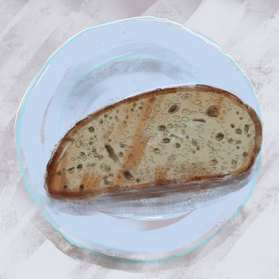
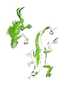
How to draw like a natural: Another crucial lesson: don’t skip ahead. Keep working on the basics. Draw simple objects. Draw your lunch. Draw a shoe. Just stick to using a black pen. Don’t plunge into portraiture or three-point perspective or advanced watercoloring. Develop your confidence in the building blocks of drawing: lines, angles, measurements (I explain more in my kourse,  How To Draw Without Talent).

And if you can’t quite capture what you’re seeing yet, write down your observations. Draw an arrow to the drawing that explains how the shadow looks, point out the highlight, record what you are learning. Just the act of writing information down, helps your memory retain it. Then look for other examples of what you have observed.

The more actively you engage, the more the lessons become second nature.  And that’s really where you want to be, to draw without having to think, to intuitively translate what you see into line son the page.  But, like learning to walk, to tie your shoe, to throw a ball, to drive a car, it takes lots of repetition to build the neural connections that make a new skill feel natural.

How to motivate yourself:  And of course, if you don’t want to practice, you won’t. It’s crucial to stay motivated, even if you’re not on the verge of a career retrospective at the Guggenheim.

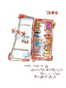
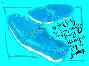
One way is to set yourself small goals that you know you can achieve. For instance, do a drawing every day. Even if it’s just for two minutes, pick up that pen. Or commit to filling an entire sketchbook in the next month. Then celebrate by buying a new art tool. I spent a year drawing with one type of black pen. Then I allowed myself one grey brush marker. A month later, I added a different grey, and slowly worked my way up to a bag full of color markers over a year. The next year, I bought myself a cheap watercolor set. The year after that, a really good watercolor set, and so on.

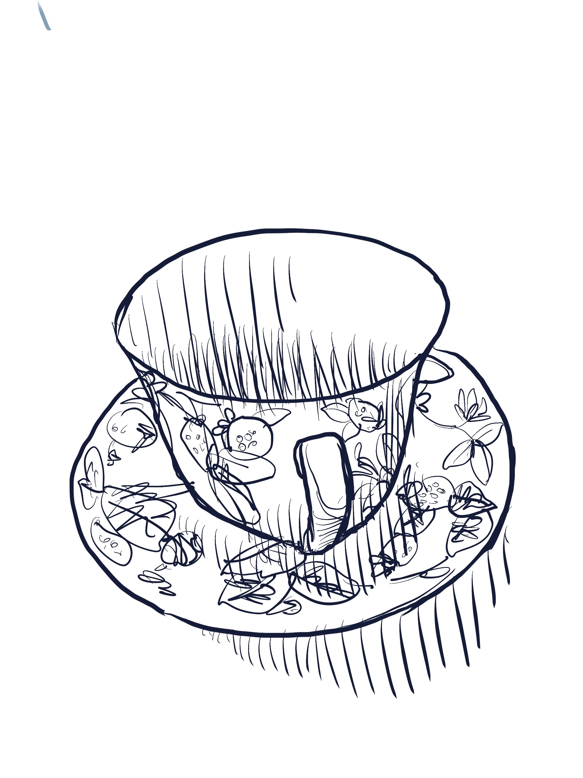
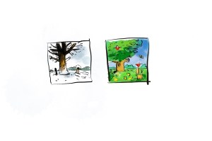
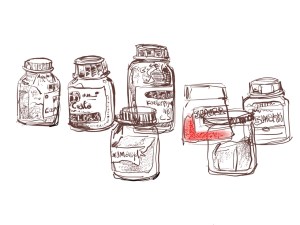
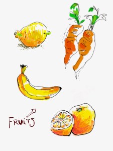
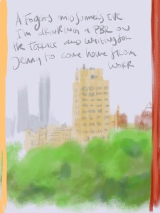
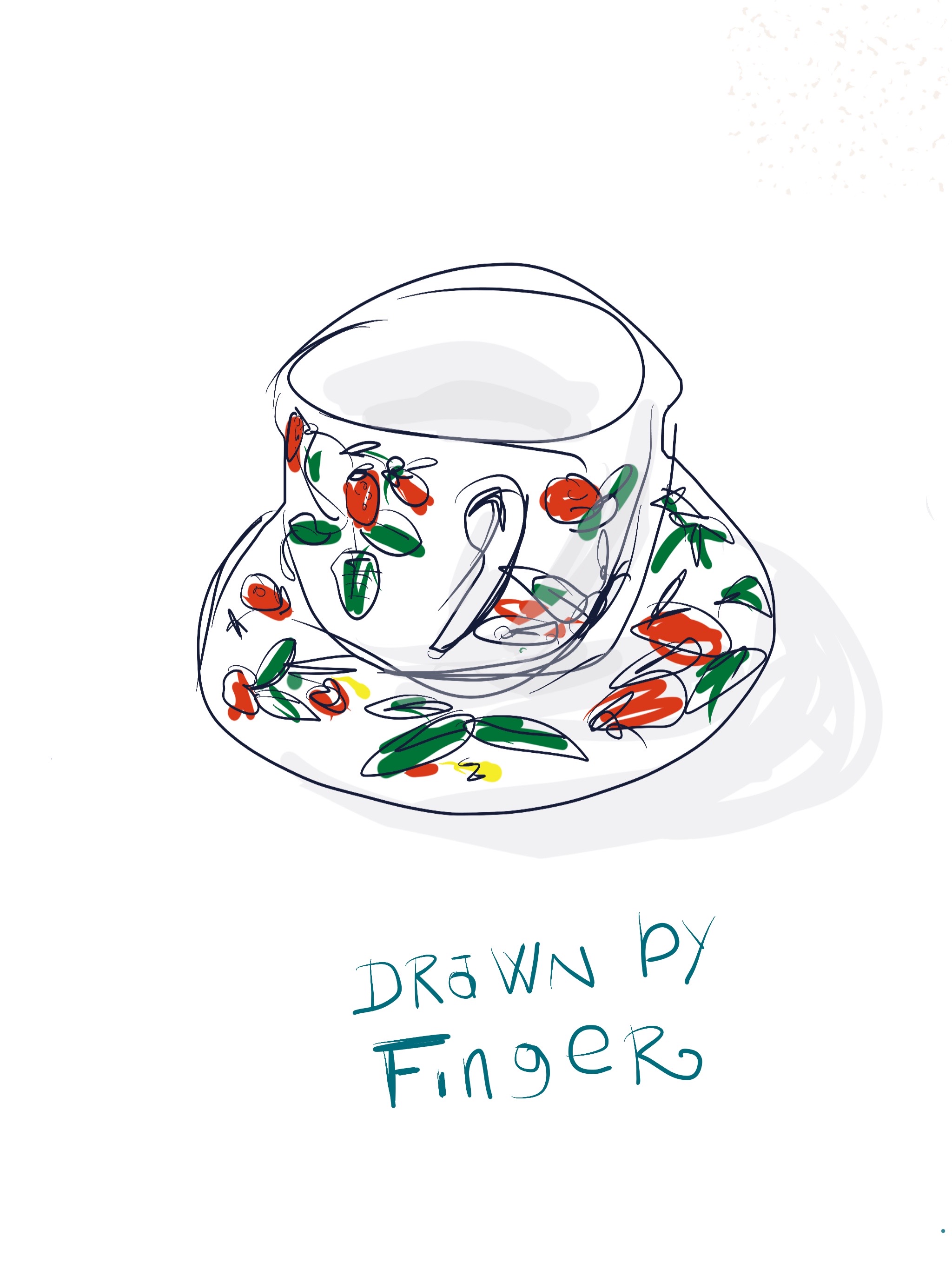
Try focussing on a single daily subject for a month. Pick a subject you find interesting but don’t try to make an “art statement”. It’s just a theme to practice variations upon. I drew my teacup every single morning. I drew a selfie every day. The view out my kitchen window. Cars on my block.  A photo from the front page. Now I draw a dog every day.  I get a sense of accomplishment when I see how much I am drawing, not just how “well” I am drawing.

Whenever you complete a sketchbook, spend some time with it. Look back at each page, study what you did, how your work has changed.  Get out your phone and make a video as you  flip through the pages.  Share it online with friends you can trust. Their support and encouragement will help keep you going.

Three facts to write in the inside cover of your sketchbook:

1. Never compare yourself to other artists. Don’t compare your first drawing to their reproduction in a coffee table book. Let their progress inspire but not intimidate you. Compare you to you. That’s all that counts.

2.  You’re making more progress than you think. You may not see it but it’s happening with every page. Guaranteed.

3. Everyone struggles at the beginning. Check out early van Gogh drawings. Awful. Struggle is normal, inevitable, a positive sign that you are working things through. Your early drawings are zero indication of what you will achieve in time. Zero.

I hope this helps. Remember, you can do it.


This post was originally written for the Sketchbook Skool Zine. If you liked it, consider subscribing. It’s free and full of interesting stuff.

Pad and i: 7. I’d like to make a toast.

When I first started to draw, my goal was never to make pretty pictures. If you’ve read my book Everyday Matters, you’ll know that I came to drawing as a form of meditation, a way to ground myself in the real and actual rather than living exclusively in my rather tortured brain. My practice was to draw the things around me, in a straightforward, observational way, using just a cheap pen and a sketchbook. I was making a record of my life, of the quotidian beauty that surrounds me.

So, could I use the iPad to keep doing this?  At first, I couldn’t as I kept tripping over my enormous toolbox. The ability to tweak every line to a fair-the-well would distract me from making a strong connection between my brain and the object I was contemplating,  I’d keep switching up pens, erasing, undoing, tweaking colors and so forth, all of which would shatter the meditative spell I was used to. I was overwhelmed by my options. If one is used to taking a gentle stroll through the countryside, being dropped into a Formula 1 racer without a driving license would be understandably distracting.So I dialed back and just focused on just making a simple black line. I drew my most familiar subject, a floral tea-cup, which I had drawn dozens and dozens of times over the years. These drawings were familiar and comforting but were like driving that racecar in a school zone. I wanted to open things up, to expand beyond where I’d been and get comfortable using my new toys.

I tried one colored pencil next.


Then I tried getting even more hands on — by drawing with my fingers.

Then I added a colored background and got a little abstract.

Finally,  I tried a bit of whimsical collage.

These experiments showed me I could do what I’d done in my sketchbook and also go a lot further — if I took baby steps. Slowly, I began to capture what was around me, just as I had when I started, twenty-odd years ago: adding one tool at a time until I felt comfortable with it, then trying another.

I’d originally spent a year drawing with a Uniball roller pen. Then I’d added a felt marker, then a single grey brush marker. Then a handful of cool and warm greys. Next one orange, then a green and so on. After another year, I filled an entire sketchbook with colored pencil drawings. Then I got my first watercolor set. In all, it took me at least four or five years to consistently make reasonable color drawings in my sketchbook.  I’d have to have a little patience to feel as comfortable with my iPad.

After two more months of work, I could draw things that looked almost photographic. My ultimate goal wasn’t to make this sort of art but just to push myself and my tools to see what I could do with them. The more familiar they become, the more transparent they are, letting me focus on my subject without thinking about knob twiddling and technowizardry.

My goal is to stay in the flow, even through this sheet of glass.

(To be continued)

Pad and i: 6. East Hampton.

Our friend Suzanne invited us to spend a long weekend at her house in East Hampton and we packed up our swimtogs and the iPad. We rode a crowded bus the length of Long Island and Jenny and I were forced sit a couple of rows apart.

I used the ride as an opportunity to draw her from life, trying to capture the light on her hair. I used eight layers with different settings to capture the effect of the light — hard light, soft light, multiply, overlay and various degrees of opacity. The colors aren’t bright and cartoony like my earlier paintings but have a softness and glow that suggests the afternoon sun.

Jenny on the Jitney

The next morning as we tucked into our breakfast, I decided to tackle the reflections on the  pool, the light on the bushes, and the giant inflatable swan that drifted across the water. This painting has 16 layers to capture the hard reflections on the railing, and the diffused focus of the  bushes beyond the fence.  I also  conjured up Hockney again as I studied the glittering highlights and the varying shadows on the bottom of the pool.

Suzanne’s pool

Suzanne’s dog, Lou, is a lovely and manic creatures, endlessly chasing after balls and circumnavigating the pool.   I wanted to draw her as a thank you gift for Suzanne but it was impossible to slow her down enough to sit for me. So I snapped  a picture with the iPad camera, then split the screen so I could look at the photo side by side with my Procreate canvas.  I don’t love drawing from photos — but it was the only way to do a decent job of it.

I only used seven layers this time to achieve the layered look of the many colors of her fur and the soft flagstones beneath her.This scary beetle landed on my book. I drew his shape as quickly as I could be before he crawled away, then added textures from memory. I quite like the wood grain.

Meet the Beetle

On our final morning, as we waited to head back to New York, I quickly drew Jenny again, this tie in a fast, more abstract style with bright colors. I wanted to break away from the painstaking duplication of reality and the endless layers and tricks.

Jenny and her Kindle.

I wanted to see if I could figure out the technical components to make paintings look fairly realistic — but that is not my Holy Grail. Instead, I want to play with all the tools until they become like second nature, and then express myself as I feel at the moment. I want to use the iPad like I use my sketchbooks, to capture the world around me and the world inside me, my moods, my quirks, my points of view.  Reproducing photos is like painting-by-numbers. It’s possible but it’s not the point.

(To be continued)

Pad and i: 5. Surf, Dave and cartoons

In early August, we once again packed up our swimsuits, fat novels, and sunscreen and headed south to Surf City where the Kane family compound sits a few blocks from the beach.  The summer before I’d watched enviously as Tommy drew broiling semi-nudes in his sketchbook and I was determined to spend the idle hours working on my iPad chops.

I didn’t feel like focusing on drawing sunbathers — I’ve done it before and it always makes me feel a little pervy. Instead, I wanted to draw the water and the sun-bleached houses, to continue the exploration I’d been doing with my urban sketches in Manhattan.

I used a similar technique, constructing buildings out of simple shapes, bright colors, flat lighting. I tried drawing people too but with less success. Overall the thing I liked best was the colors. More than watercolors, the iPad captured the bright August sunlight.

I‘d been studying Hockney a lot in the weeks before vacation and I was channeling his palette  I’d spent an hour or two in the McNally-Jackson bookshop, poring through his new book called Current which contained hundreds of iPhone and iPad drawings. There’s a simplicity to each stage of his work which builds up to an intense richness to the final results. He attacks the screen with clarity  and bold colors and keeps layering on detail. I tried to use a similar approach but I still didn’t dare to use colors as cartoony and bold as he did. Inexpertly done, they can just look garish and amateurish.

David Hockney Exhibition at the NGV

The last painting I made hinted at a new direction. I’d woken up early on the last morning in Surf City. The room was still dark but little fingers of dawn thrust themselves around the edges of the blinds. I picked up my iPad and started to construct the shapes of the window, the air-conditioner, the blinds, the bureau and then to suggest the variations in light. It was simple, crudely drawn through bleary eyes, but it was not a bad piece of observational drawing. I could still put aside style to draw just what I see.

I was still feeling a little defensive about these new drawings. That’s what happens when I am around a master like Tommy who is cranking out work that is so much more careful and labor intensive than mine. Tom’s not one  to hand out unearned praise and he was just grunting at the various iPad pieces I showed him. A little petulantly, I decided to try some thing one can’t do in a plain old sketchbook: make the pictures move.

I downloaded a few different animation programs and began to experiment. I never found an ideal program, something as well-designed as Procreate is for drawing Most were for little kids and had clumsy interfaces that were very restricting. The best is called Animation Desk and I managed to wrestle a few little samples out of it.

I tried rotoscoping some short pieces of video which is a laborious and mechanical process that delivers somewhat synthetic results.  Here’s a little film of my dogs walking through the study:

Then I tried drawing more from my imagination, a chicken running around:

And finally I took a couple of the drawings I’d done at the beach and made them move:

A fun experiment. but not really what I needed to be spending my time on.  It’s nice to know I can make a small bit of animation now and then but I was far from doing what I wanted with static drawing on the iPad.  I came back from the beach a little browner and wiser but with still a long way to go.

(To be continued)


I’d love to know anything you think about this process — with one exception. Please don’t tell me you still prefer the analog drawings I did with ink and watercolor. I know that and it just make me crabby to hear it from you. I already own a large monkey to share that sort of insight.


Pad and i: Part 4. Guttenberg Comes Alive!

The next big influence on my iPad exploratory was a tech innovation from centuries ago: moveable type. In Mid July, I took a week-long workshop in letterpress printing at the Center for Book Arts and it was quite profound.  I wrote about it soon thereafter.

In the process of figuring out how to compose the type, I first created a layout comp in InDesign. Then I tried to replicate it at the press with hand set lead type. It was impossible and, I realized, pointless to try to just mimic one technology with another. Sure, I could just hit “print” on my laptop and my laser printer would crank out the page with no-muss or fuss. But that defeated the whole point of the experience. And besides, it wouldn’t actually look the same. So, I decided to push my hand set type as far into its own domain as I could. I used big wooden typefaces and printed it in graduated colored inks. What I printed was too big, too organic, too imperfect to have been made on a Mac. And that’s what made it special.

This revelation started to haunt my iPad exploration.  What was I doing with this gizmo? Why was I trying to reproduce my 180 lb. sketchbook pages, my steel nibs and dip pen, Felix’s watercolors — with this $1000 tablet? It was so cheesy and lame.

Instead I had to embrace the way the iPad worked, go towards it — rather than trying to create a synthetic echo of the art I’ve always made. I’d have to be Dylan going electric. Frampton on TalkBox. Cher on AutoTune.

The next week, Tommy Kane and I did some urban sketching around town, perched on our little folding stools. I knew Tom was not impressed by the gizmo or my efforts so far, but I needed to push myself into a new way of seeing, to try to discover how to create something that I could only do on the iPad.

I started to work in block shapes in layered bright colors. In some drawings, I processed the layers to create unexpected effects. I even turned on brightly hues street scene in a study in shades of grey by just flipping a slider.

Two particular drawing that I did on while sitting on the curbs of the Village started to capture something new. One I drew of some NYU building on West 4th Street in bright cartoony colors. Then Public Theatre on Lafayette Street and finally a corner off Washington Square late at night.

They all had a hand-drawn, anarchic and unplanned feeling, sort of evocative of 1950s Ronald Searle inspired animation — but not quite.  And the thing is, they had colors that were impossible to create on paper, in any other medium.Print them out and they’d be dead. They were made of light. They were those amazing intense colors you only get by looking at a screen, utterly modern, and they made those street corners come alive.  They were unlike anything I’d made before, and I was very happy.

(To be continued)

I wanna give you something free.

I love art but there are times I worry I’m doing it wrong. Like when I go to a Chelsea gallery and I am mystified by what’s hangin on the walls. Or when I go to the Met and am absolutely knackered after just half an hour of walking around. Or when I can’t remember whether it’s Manet or Monet. Or when I find myself getting super irritated by the way other people behave in the Whitney, snapping Instagrams and saying inane things about the Biennial.

I never studied art or art history and, truth be told, there are times I feel like I have missed something significant. It’s like drinking fine wine or watching the NFL; I can’t tell what I actually like or have any idea how to discuss it.

It all just seems sort of heavy — unnecessarily so.

That’s why I wanted to use my role at Sketchbook Skool as an excuse to learn more and fill this deficit in myself and my friends. When my pal Bridget wrote a book on the subject, a sort of primer on art appreciation without fear, loathing and manbuns, I thought it would be worth spending some time bringing it to life in an online kourse.

We spend months working on it, turning a book without illustrations into a dozen and a half visually dynamic videos, full of cool locations and special effects and animations to make the ideas come alive.

You’re probably saying, what are you on about? Stop whinging and go to the New Museum like a man.”

You’re probably saying, what are you on about? Of course, I like art, that’s why I even bother reading your stupid blog. Stop whinging and go to the New Museum like a man.”

But the fact is that we rarely talk about art the way we talk about movies or Netflix shows (or maybe I just have the wrong friends).We don’t have the guts or the vocabulary, we feel pretentious, we don’t know how or with who to talk about it. Yes, you too, with your yellowing Art History diploma, when was the last time you just sat around with some pals guffawing about Dan Flavin? Gimme a break.

Any way, let me stop insulting you long enough to ask you to join me on Monday when our new kourse, How Art Can Make You Happy debuts at Sketchbook Skool. It’s less than a latte and a ticket to MOMA and it’ll just take you a jolly afternoon to absorb it.

I really want to hear what you have to say and this will be a safe and fun place to do it.  I hope to see you in klass. Or I’ll snub you at the Gug.

P.S. And, because I love you and really think this will be worth your while, I’ve convinced the brass at Sketchbook Skool to give you a sample lesson, absolutely free. You’ll have to pay for the rest when you sign up for the kourse here.

Pad and i: Part 3. Double X

The summer stretched on. So did my anguish. Despite generating dozens of atrocious eyesores on my iPad, I was still no closer to getting the hang of things. So I made a desperate move: I started watching YouTube instructional videos. That the iPad is perfect for.

After a lot of painful grazing, I came upon a couple of useful resources. James Julier is the Bob Ross of Procreate  — his paintings are mundane,  his voice is soporific and his thumbs are strangely shaped — but he does go step-by-step through many features and techniques and this hour-long video was pretty helpful.

Brad Colbow has several great tutorials — I especially liked Drawing Comics in Procreate from Start to Finish. He’s funny, smart, and anticipated many of the pitfalls I encountered.

Under Brad’s influence, I decided to stop keeping a sketchbook journal and start making goofy cartoons instead. It was easy to simulate printing techniques like flat color panels and Ben-Day dot patterns so I plunged in and made a few comics:

I did not quit my day job.

Earlier in the Spring, I had grown quite obsessed with Felix Scheinberger’s book, Urban Watercolor Sketching. (I made this video about his work).

Felix’s drawings seems so simple and his watercolors so clean, and for months I had vowed that one day I’d sit down with the book and really work out how he does it. Then I realized that I could kill two birds with one auto-didactic stone if I tried to reproduce 1) his drawings using 2) the iPad.

I knew Felix uses soft, squishy pencils and procreate has a squishy 6B pencil that’s lovely to draw with. (If you hold the Pencil® at an angle, it gives you fash graphite smeary lines just like the real thing). He also uses a soft, pliable technical marker and, of course clean watercolors. I began by drawing the art on the cover.

Next, I just started working my way through the book, drawing by drawing.  I found I could copy his drawings pretty well and it definitely loosened up my drawing style as I’d hoped. But simulating watercolors on the iPad was a whole other deal.  There are tools that let you paint in the shape of watercolors and you can create layers of color that sort of simulate glazes but they are much harder to use than a brush and palette.

I drifted from Procreate to Adobe Sketch which at the time had a better way of blending wet on wet and even included a little fan that would dry the layers and stop them from bleeding. I ended up making watercolor layers and then exporting them to send back to Procreate. It was fiddly and inexact and the results lacked the luminosity and character of Felix’s analog paints. Nonetheless, the project kept me busy for much of the next month and my chops started developed further — thanks to two great teachers with Xs in their names: Felix and Experience.

Here are some of the images I made:


Someone left a comment on the last post in this series, saying they assumed that in the next post I would reveal the a-ha moment that turned my iPad drawings from crap to genius. Alas, there was no such moment on the road to Damascus. Instead, a long slog through various small breakthroughs.  Stay tuned for the next ones.

(To be continued)

Pad and i: Part 2. the Month of Drawing Dreadfully

In the fall of 2015, Apple released the iPad Pro and the Pencil, a sort of bitten-off knitting needle. Despite being a fanboy for three decades, I’d been disenchanted by a lot of the recent releases and didn’t pay much attention. I already had two iPads kicking around the house and the addition of a drawing tool didn’t justify the near $1000 price tag.

Then I started to see Facebook posts that made me sit up and drool.

People seemed to actually be doing decent drawings with the thing. Drawings that didn’t look like they’d been made with a computer at all. Drawings that kept getting better and better as people got the hang of the thing.

The next time I was in an Apple store, I fooled around with the Pencil a bit. It was pretty damned responsive. But it wasn’t instant love. I didn’t like the idea of drawing on a cold sheet of glass. And what would I do with a bunch of digital drawings? Print them out? F’what? They weren’t going to replace my sketchbooks so how could I justify spending all that money? I imagined a giant iPad lying in a stack with expensive coffee table art books I’d never gotten around to reading. Nah, not for me.

Another year went by and this Spring, I found myself visiting Apple stores more and more, trying different apps, counting my pocket change, flirting. My heart was wandering because, frankly, my analog sketchbook practice was withering. After not travelling, not having a kid in the house, and spending all of my day in front of a computer at home surrounded by things I’d drawn a dozen times already, I just didn’t feel inspired to record my humdrum life in my book as I had for decades. Things got so dull, I’d spent a month just drawing my tea-cup over and over.

One fine June day, I crept out of the Apple store with a couple of slim boxes in an unmarked white bag, my heart pounding. I felt like I’d just bought a blow-up sex doll or something, a totally frivolous guilty pleasure I had no business owning. I slunk home, downloaded a few apps, and started to draw.

It was horrible.

Off the bat, I was overwhelmed by all the tools.  I had an infinite palette, hundred of pens and brushes that could each be tweaked and finessed. A simple drawing and some words — a thing I’d made a zillion times over two decades — looked murky and overworked as I worked through my gigantic toy chest.

On top of this ineptness was a deep sense of purposelessness. What was I trying to do here? Was this another form of illustrated journal, only more awful looking and frozen inside a tablet? Was it just an expensive toy? A doodle pad? Was I trying to make art? To be a digital illustrator? Was I wandering away from the whole reason I draw, entranced by a digital glow?

I had started drawing as a way to meditate, to engage with the moment, with what was happening right in front of me, the reality of my life. As the Master said:

 “The secret of health for both mind and body is not to mourn for the past, worry about the future, or anticipate troubles, but to live in the present moment wisely and earnestly.” ~ Buddha

Drawing had helped me do that and it had saved my life.

But this iPad distracted me in a thousand ways, placed barriers between me and the moment, between my observation and creation. This bewitching gizmo had me relying on cheap tricks like Technicolor backgrounds, gaudy palettes, airbrush sprays, and endless clicks on the undo arrow to mask my hopelessness. Instead of approaching Enlightenment, I was just scraping an overgrown swizzle stick across a sheet of glass, filling my screen with proof that I just could not draw at all any more, guilty at my frivolous extravagance, afraid to quit, but clueless as to how to proceed.

I was starting at Square One, or even worse. At least when I’d opened my very first sketchbook twenty years ago, I knew how to use a pen, how to turn a page, but now I was just blind, dumb, and wearing oven mitts. I am a published author, an art school founder, an “expert”, and yet I was drowning in a vortex of pixels with no shore in sight.

And so it went for a bleak month or so.

(To be continued)


Pad and i: Part 1. Passion and revulsion.

When I was nine, my first stepfather would let me tag along to the computer room in the basement of Australian National Uni. It was a big room with lino floors and rows of clacking mainframes. Bill would hand a big cardboard tray full of index cards over to a grad student with muttonchops who would feed his math program into the computer’s maw. Tape reels would whirr, lights would flash, printers would clatter, while we would sit and wait for the results.

On the wall over the computer bank, there was a gigantic picture of a naked lady printed out on green and white striped computer paper. Upon closer inspection (and I inspected it very closely, it being a naked lady and all), it turned out to be made entirely of numbers and letters, what was known as ASCII art. To nine-year-old me, this piece of early nerd porn was both fascinating and terrifying. And that sentiment has more or less characterized my feeling about computer art ever since. I want it — and I am repelled by it.

In 1984, I got my hands on my first 128 K Macintosh. It came with a super crude application called MacPaint (it cost $125!) that let you draw in black and white. No color, no grayscale, just a bunch of simple textures. It was like painting in tweed holding a cinderblock with a catcher’s mitt. I fiddled around with it for ten minutes, then went back to the miracle of wordprocessing.

Later that year, I came upon a ground-breaking book called Zen and the Art of the Macintosh: Discoveries on the path to computer enlightenment which introduced me to the idea that you could somehow get all kinds of photos and calligraphy and textures (Woodgrain! Thumbprints!) into your computer and add them to your desktop publishing. Seriously, ye people of the 21st century, this was a Gutenberg moment for me — it rocked my world.

Next revelations to come down from the mountain in the later ’80s: Quark Xpress and Illustrator 88. The first helped me churn out reams of books, posters, and fake magazine articles, on my purloined laser printer. The latter confused and frustrated me. I couldn’t figure out how to cut paths or turn lines into curves, there was no preview mode, and drawing with a mouse was still as alien and annoying as Jar Jar Binks. I could write and publish entire books but I couldn’t draw even a smiley face to serve as an author photo.

Through the 1990s, I admired and hired illustrators who worked in Photoshop and Illustrator, making gorgeous airbrushed looking paintings with style and character and I’d beg them for tutorials only to stop them midway and throw my mouse down in disgust. This wasn’t drawing. It was engineering.

Next potential breakthrough, the holy tablets of Wacom. Finally, I had a thing that was sort of like a pen (only super-stiff, unresponsive, and plasticy) but I’d have to draw down here on the tablet while looking up there at my screen. Then I’d have to constantly reposition my cursor, right click things, open windows, command- this or that, and it all felt unnatural and mawkish. Worst of all, I would draw like I was word processing, putting a line down, then immediately going back to erase and redo it, then make it bigger, then lasso it and nudge it over, then look through some filters, then reduce it, shift the colors, blah blah… It was nothing like the directness and simplicity of a pen in a sketchbook, my own true love. Again, I met loads of artists who strummed their tablets like Andrés Segovia but I just tied my fingers into knots.

Ten years ago or so, my boy David Hockney started sharing his first iPhone drawings. He drew them in bed with his index finger while still having his first cuppa. Then in 2009, Jorge Colombo, a guy I’d met around town and who seemed like a regular human being, published the very first New Yorker cover drawn with his index finger on the iPhone. Come on! A New Yorker cover?! With the finger?

Next up, the first iPad. I got one days after it was released in 2010. I immediately downloaded a drawing app called Brushes, cracked my knuckles, polished my fingertips — and made utter, breathtaking crap. I tried a couple more times but it was awful. I hated the lag, the feeling of the glass, the garish colors, the interface…. I went back to using my pen to draw with and my index finger to scratch my butt and pick my nose.

Ever so often I would see some insane masterpiece drawn on the iPad and I would whine, whimper, and order a new stylus. They all turned out to invariably to be metal sticks with felt balls at the end, like spindly QTips that balked and scraped, a long cry from my favorite drawing pens.  When France Belleville Van Stone showed me her digital sketchbooks done with the Paper app and a plastic thing that looked like a carpenter’s pencil, I broke down and spent too much money buying my own. It broke the first day I used it. Back to the sketchbook.

(To be continued…)