

I really enjoyed Ric Burns’ two-part PBS documentary on Andy Warhol. Andy’s color sense was superb and it had an immediate effect on my painting.

I love my new paints a lot and I am trying to use my colors as fresh onto the page as possible. Somehow paint dies on the palette a bit but, when I layer pure colors onto the page, they remain vibrant. Compare this painting of Joe with the one I did with my old paint set and pre-Andy.

This poor critter was waiting for me on the way to work; I have never seen such a bird, alive or otherwise, in the city before. It took me two goes to capture his lines; I also had to remember his color scheme as I only could paint him when I got home in the evening
Groceries by Harry Kalmer
 Harry Kalmer of Johannesburg invited me (and lots of talented artists including EDMers Michael Nobbs, Nancy Ghandi, and Trevor Romain) to contribute illustrations for his new book, Groceries: 56 Stories Oor Huishopudelike Produkte. (If that title seems a little opaque, it’s because you don’t speak Afrikaans). I just got a copy today and it’s full of lovely drawings of food and products.
Harry asked me to a drawing of a bowl of pasta. Here’s the drawing:

A Fountain of Learning

As my Rapidograph was still empty, I continued drawing with my green fountain pen. I drew this funny old car against the curb, managing to overcome my usual disasters with angled wheels. The ink in my fountain pen is not waterproof, so I just hit the shadows a little bit with a blue Crayola.

I change the color of the ink cartridge in my fountain pen every time one is empty so the ink is always changing hue. Right now it’s going from black to blue; next up is a vermillion cartridge, so I’ll be entering a sort of purple phase pretty soon.

Ronald Searle is my idol, my spiritual guide, my ideal. Drawing with his tool of choice, the fountain pen, made me want to look at his work again so when I got home, I filled up my Rapidograph with fresh India, opened my copies of Back to the Slaughterhouse and U.S.A. for Beginners and copied some works of the master, Then I drew my slumbering mini-pup, Tim.
New color

For the past couple of years, I have used a fairly good set of Grumbacher “Deluxe” watercolors in a big plastic box. They have served me well all over the world,and I have grown quite used to their slightly chalky hues and know how to mix virtually any hue with the two dozen pans in the palette.
I would compare painting with these Grumbachers to a $10 bottle of Merlot. Certainly not bottom of the barrel, not embarrassing, but I know there’s something a lot tastier out there, probably at a much higher price point. Every time I browse an art supply store, I glance into the locked-up showcase at the gleaming sets of real professional artists paints. They tend to start at about $75 and crest a C-note pretty quickly. Dear, even for a New York gazillionaire like me, and I usually end up shrugging and scoring another familiar old set of Grumbachers for about twenty bucks.

FInally, I caved and bought myself a teeny lovely set of Winsor-Newtons in a leather case for about $75 (they’re cheaper, I now see, on the web). There are only a dozen colors but they are revolutionizing how I paint. I have been using them to paint my #600 series of portraits and they are bright and bold like nothing I’ve used before, pushing me to wilder and wilder color combinations. They are so intense and creamy.
Just a wee dab on the end of my sable is like handling a freshly honed scalpel. A teeny touch and everything changes. I am mixing more and more on the page and forsaking my palette; I find this makes my colors crisper and stronger than anything Grumbacher could conceive.
I am not urging anyone else to use these paints. I know that Roz loves a man named Daniel Smith and that for many beginners a box of Crayola poster paints will get them on the road. But for me, right now, these are the perfect companions. It’s a new chapter, a new virulent sunset to rid off into.

I am now also firmly committed to my .35 Rapidograph. It hasn’t balked or clogged on me much and I’ve only had one brief leaking issue. The line is clean, consistent and yet somehow more liquidy and velvety and creamy than anything a disposable pen can give me. So far, it’s just conked out on me once far from home; I pulled out my trusty green fountain pen with its cheap water-soluble refill and polished off the drawing.
Fleedom's just another word for nothing left to delouse.


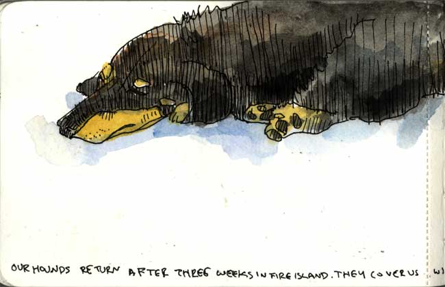


While we were away, so were our hounds, Joe and Tim. They went to stay with the Globuses (their breeders) and various relatives in Fire Island.The highlight of their vacation was when Joe, a natural hunter, escaped from the compound and went over to the neighbors where he found a dead (and non-rabid) raccoon. Tim (Robin to Joe’s Batman) followed. Their various cousins stayed safely at home.
We were hound-less for quite a while upon our return as it took forever for Captain Ron Globus to make it back to the city with his boarders. We consoled ourselves by sleeping in and missing morning walks.
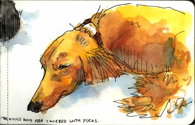
Joe and Tim brought some friends back to the City– a pack of fleas. They were both scratching and nipping until Jack and I took them for a scrub. Normally, we wash them in the kitchen sink but this itchuation called for professional help. We scooted them right over to the Village dog wash and soaked them in some special flea bath until they were squeaky clean and calm again.
Though I try to control the temptation to use blue shadows in my paintings, I love the way these worked against Joe’s ginger fur. In fact, let’s be honest, I rarely avoid the temptation to use blue shadows. I’m sure if I was lady, I’d wear blue eye-shadow and coral lipstick like my mother-in-law Phyl used to.
Late Night

I have been quite busy launching some new advertising for Chase over the past couple of months. You may have seen my newest spots on the air for the new Chase Freedom credit card. If not, check ’em out here (click on Watch TV Spots).

Anyway, making these spots was fairly arduous and involved endless long nights in a studio, watching digital paint dry, drawing (and painting with tea) and eating biscuits. We also created half dozen digital kaleidoscopes that are in magazine and newspapers and wild posting around about.

One of the most interesting things about the project has been that we bought the song, “I’m Free” by The Rolling Stones and then worked with Moby, Fatboy Slim, The Postal Service and Hot Chip to reinterpret it. Mick Jagger sings the vocals and everything is brand new. The Stones are releasing our music as an album on iTunes in the next couple of weeks and we are about to do a new round of “I’m Free” remixes with other great artists.

I was appropriately melancholy on the 5th anniversary of the 9/11 attacks, thinking about how things have changed and how much damage has been done to us all by those maniacs in the caves of Afghanistan and the conference rooms of Washington, D.C. I have been speaking out against this madness since the beginning and it seems that finally the rest of this country is coming to its senses.
Meanwhile, it was a sunny lovely day (I call it ‘9/11 weather’ as it’s always like this on this day) and so I drew the buildings that are still left standing in my hometown.

I have watched this new Frank Gehry building go up on the West Side, bit by bit, every day on my way to work and am really falling in love with it. At first it seemed so un-New York, like many of the new cartoon-colored, glass boxes cropping up in the current building boom, but watching its undulating windows reflect the clouds is really stirring. The construction of the underlying concrete structure was fun to watch, seeming completely off kilter and doomed to collapse (apparently people regularly called in during that phase, to point out to the contractors that they were doing something horribly wrong). It also seemed like there were a lot of problems with the complex, twisted glass; panes were regularly swopped in and out.
Sometime I pass right under the building on the West Side drive but usually I admire it from 10th Ave. across the rusting elevated train tracks (soon to become a public park) and the umber tenements, a lovely juxtaposition of 19th, 20th, and 21st century New York.

Seventh Avenue was blasted through the West Village in the late ’50’s, cleaving buildings, leaving unusable little triangular lots, and wreaking all sorts of havoc across the organic twists of the old Indian paths. Streets go higgledy-piggledy and then stop abruptly. The only thing that got completely away from me is the scale of the truck on the left hand side which, to correct my screw-up and as a tribute to Lucinda Rogers, I made transparent-ish.
Street Folks

People walking down the street are one of the more challenging subjects for me draw. They are always changing shape and size or just disappearing before I can study them long enough to get down on paper. As I’d rather not end up with every single one of my cityscapes looking like someone just dropped a neutron bomb and depopulated the place, I try to practice a technique for capturing people in motion. It has to be atechnique rather than an actual observation, of course, and so I have to work out shorthand and special practices to get the job done.

When I draw a person, say, waiting for the light to change and standing still for a moment, I can usually capture about half of their pose. Then I watch another person in a similar position and finish up a composite of both of them in one figure. I figured this approach out at the zoo in Milwaukee ( sorry, the the Como and Minnesota Zoos in Minneapolis!) a couple of years ago, when drawing animals with my pal Roz. Many animals would assume three or four different positions but then go back and forth between them so I just did several drawings simultaneously on the page, moving back and forth between the poses.
I did these particular drawings one evening while waiting for Patti to meet me on the street corner. It was fairly hectic and there was a lot of coming and going so I found it quite hard to really lock into to the exercise. I imagine that if I had the patience to take more life drawing classes and concentrated on short poses, I’d be well served.
I learned quite a lot drawing stuffed animal specimens at home and at various natural history museums. Maybe I should visit Madam Tusaud’s. It’s just so hard to find decent human taxidermy.

Notes to Myself

I’ve used every sort of journal-book over the past decade, but the one I’ve returned to the most was the pocket-sized, drawing Moleskine. The paper is a little odd; it has a water resistant treatment designed, I guess, to make one’s page hardier in the field (I imagine them being tested in Amazon jungles and blustery Scottish heaths) which became quite frustrating when I first got into watercolors. I also got fed up with the size (3.5 x 5.5″) and wanted to do bigger and bigger drawings.
When I went to Amsterdam, I decided to bring a long a little Moleskine, though this time I used the new watercolor book.
My friend, Tom Kane, had made an observation to me a few months ago: that there is a huge difference between one’s approach to journaling in a bound book vs. a spiral bound book. Since I had been using the latter for the past couple of years, I discounted his distinction. But then I looked through some of my earlier journals and reconsidered. Tom’s main objection is a matter of commitment; he says that there’s a real sense of permanency to a bound book: the pages can’t be ripped out so one works more carefully. I think that’s true to some extent but I rarely tear out pages. For me the difference is that when a book is perfect bound, one can think in terms of spreads far more easily. Increasingly over the past year, I have just been doing drawings in the middle of a page and not thinking nearly as much in terms of design. lettering, writing, all the things that make for lovely journal pages.

My hiatus from this site and my change in materials have been all part of my growing unhappiness with the path I’ve been on. I would say I’ve been ‘pursuing’ this path but I haven’t been doing it consciously. Instead I have been ambling and stumbling along, not paying enough attention to why I’m going where I’m going, pursuing objectives I now question.
I began drawing in spiral books because they were easier to scan. In short, it was more important to put my journal pages into a computer, a book , a magazine, a website, that to record and cherish my life. Sure, these are not mutually exclusive goals, but increasingly I was making decisions about my art because of the pressure of external forces. That ended up making me unhappy. Drawing has brought so much to my life and suddenly I felt I no longer had that peace and pleasure. I was spending more and more time administering web sites, talking to people about teaching opportunities, doing interviews, planning sketchcrawls, answering email, and less and less time drawing,. My most recent journal seemed symbolic: a big, bright red journal, custom bound with gold letters on the cover. Cool in a way, but ostentatious in many more.
My ego seemed to have taken over. Not just in the sense of being egotistical, but in the sense that I was more preoccupied with what I was than with just being. I don’t need to spend every waking moment thinking about what other people think, though the temptation is certainly there.
Over the past couple of months, I have been far more productive and exploratory. I have brought journaling back into my everyday life, I have decided to think a lot harder about the opportunities that come my way and recognize that there are only 24 hours in each day and that my priorities are: my family, my health, my job, me time, and other stuff, more or less in that order.

I do not think that I am a particularly special person and see my own flaws without a mirror. That fact has made me uncomfortable with the idea of teaching or preaching or leading or even setting an example. I also have a deep and dark streak of judgmentalism that does little but cause me pain. As soon as I come up with some fantasy of what I am supposed to be, some vaunted, lofty burnished image, reality and my inner critic soon set me straight.
I don’t want to waste a day of my life. I want it all to matter. Life is not spiral-bound and I want to cherish as much of it as I can. At times that will mean laboriously scanning and annotating drawings; at others, it will mean shutting of my computer and slipping that comfortable little moleskine out of my hip pocket and drawing my lunch.
Kitchen Window

In the morning, as I eat my breakfast and listen to the news, I like to draw the view out the window. I can see the Park and the Judson church and the layers of buildings stretched out to the Hudson River. I zoom in on little rectangles of the landscape and loosely sketch it in an old drawing book. If I don’t have time to finish it one morning, I’ll continue on another, generally with whatever pen is at hand. Some times, on weekends, I may pull out a watercolor set or a bottle of ink and a brush and add another dimension. Here are a few examples:


