Let’s Make a Map!

I just love maps — looking at them and making them too.  I started making them as a kid, and my journals (especially the travel ones) are full of maps. They’re a great way to tell a story graphically, even the ones I made up out of my imagination. And they have so many uses, from giving directions to a house guest, to recording my personal history, to recreating memories, to recording a trip to charting the geography of a novel, to figuring out the most efficient way to tackle my list of chores.

Recently, I worked with my friend Nate Padavick, one of the world’s great map makers, on Let’s Make a Map!, a great new kourse at SketchBook Skool.

We filmed it in his gorgeous studio and all around the Mission district of San Francisco and we even used a drone (an SBS first!). Nate is a great teacher and he breaks down the process of making a map into simple fun steps, then gives oodles of inspiration. It’s a short kourse, just a week long, and it’s affordably priced ($29), and by the end, you’ll have made your first map and be eager to make loads more.

Nate is a lovely man, a great illustrator, and he knows SO much about maps. He’s also the curator of two great web site: They Draw and Travel and They Draw and Cook. You must check them out…. after you sign up for Let’s Make  A Map.


Chatting. In my house. About stuff.

Recently Cynthia Morris came to visit me and we sat down for an interview because she wanted to know more about A Kiss Before You Go and the whole process of recording your life in a book.  Cynthia has started drawing fairly recently but she is a life coach and deals with creative people all the time. She describes her job as helping “people enjoy their talents and create on their own terms”.  I like that job description.  She gave me some solid advice on the direction my life is taking and I offered my own thoughts on how she could create an illustrated memoir.

Here’s a video we shot of the chat in my living room.

Cynthia posted her notes from a conversation we had once the camera was off about my advice on “8 Ways to Live an Illustrated Life“.  I hope it’s useful.

My debut on slate.com

20130302-023532.jpg

I was fortunate to get a lovely review on slate.com this week.

I was also invited to illustrate all of the articles on their book review section this month. I haven’t done drawings for hire like this in a while but it was great fun. You can see all nine of them here.

I am traveling to Bangkok right now and writing this post in the Hong Kong flight club so it may take me a while to post all of the actual drawings here. Meanwhile, check me out on slate.

20130302-023940.jpg

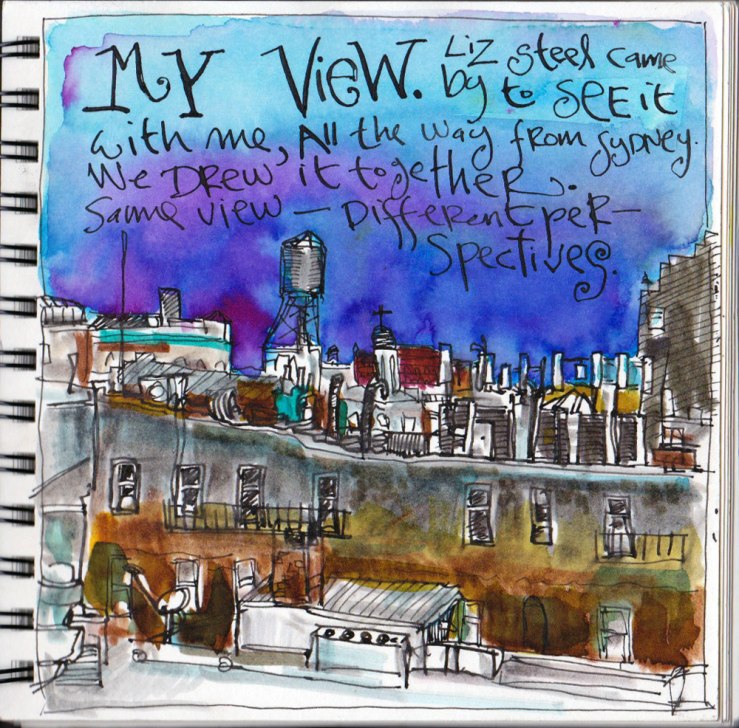
EDM #(17 &)18: Draw the view from a window of your house, apartment, office, etc.

My house is devoid of musical instruments right now so I will wait to draw EDM#17 until I come across one somewhere — stay posted. Instead I skipped ahead to Challenge #18.


Liz Steel is an architect who lives in Sydney but loves to draw, paint and travel. I have long admired her art which she tells me she just started a few years ago, influenced by Everyday Matters and The Creative License. Now she is a voracious and talented drawer of things, mainly buildings and teacups. Accompanied by her bear, Borromini, she has drawn all over the world and she is just on her way back Down Under after attending the Urban Sketchers symposium in the Dominican Republic.

Liz dropped by my house yesterday and after sharing journals and stories, we sat out on southern terrace and drew the setting sun over Greenwich Village.

Liz draws with a Lamy fountain pen and a palette full of Daniel Smith and Winsor  watercolors pans. She works quickly and lightly, stopping to wipe her brush on a sweatband emblazoned with a kangaroo.

She sees clearly and draws the minimum necessary to convey the scene, unencumbered by a need to crosshatch and all sorts of tone into her drawing. The results are as upbeat and fresh as she is.

I was feeling in a regressed sort of mood, I guess, in part because I havent drawn this view in many years, and I pulled out my sack of ten-year old brush markers (later augmented with some Doc Martin’s). The results look like a drawing I might have done in the late 20th century when I first started to draw.

I really enjoyed my visit with Liz — her experience at the Symposium and her worldwide visits with many of the artists I admire but know only through the web inspired me to want to get out and meet more drawing people in person. It’s so great to sit around and talk about pens and folding chairs and share lessons and observations.

I’m also delighted that Liz and her work are going to be in my book, An Illustrated Journey, which I understand will be available in February or thereabouts.

Drawing day

roundtablea-1I have been kerchunking out drawings today, primarily for the Morning News. As part of the series’ illustrations I’ve been doing for the newly redesigned site, Rosecrans, my editor, asked me to create a drawing for TMN’s occasional round table discussions. At first, feeling uninspired, I pulled out a photo of a conference room business discussion and turned it into this.

roundtable

The next day, Rosecrans said he liked everything I’d been doing except the roundtable illustration one which looked like I’d done it from a photo of a conference room business discussion. So I took another crack at it, this time a little more bohemian and came up with this.

peanut-vii

My next job was to create illustrations for the next installment of Peanut is coming up on Tuesday. I decided to just focus on still life objects that represent parts of the story rather than contrive some actual illustrations of people and events, my least favorite illustration to do. These are three separate ones.
At the new Blick art store down my street, I picked up a new set of Pelikan opaque watercolors. They are a little chalky but work pretty well in moderate conjunction with my transparent watercolors. A worthwhile addition for just 20 bucks for 24 colors. I also grabbed a handful of PITT artists pens from Faber Castell. I love their brush pens and now will try out the S and F pens in black and umber.
I also splurged and bought myself a new set of watercolors called “Yarka St Petersburg”. They were pretty expensive: $69 for a set of 24 pans but I really want to upgrade my colors and I hate little tubes. I’ve tried making my own set by drying little cakes in a metal box but it was a disaster.
Anyway, when I got the St. Pete’s home, I realized they were not worth the money. The pans sit in a flimsy plastic box that would crack in no time in the field. And the pans themselves sit in the thinnest plastic egg carton sort of arrangement of cups. There’s no way they will survive a year or so of daily use. Why would anyone make such a flimsy piece of shit I wonder? The Pelikans are beautifully made and designed (though the paints themselves are probably just student grade) and these professional paints were designed by monkeys who’d never seen a real human use them,. They’re going back to the store this afternoon.

Assignment of the day

It’s hot as a bastard and we are all recovering from four performances of Annie Get Your Gun in three days. I have spent the past two mornings in the air-conditioned apartment working on an assignment for The Morning News which is about to launch its year long redesign. Rosecrans, my editor, asked me to draw three illustrations to work as launch-pads for the serialized books that appear on the site every couple of weeks.
I had already done a couple of different icons for Peanut:

peanut-sonogram.gif

This one is meant to look like a sonogram of a peanut. It’s okay though a little gimmicky.

Peanut-2.jpg

Then I came up with this one based on a photo of an embryo, sort of 2001-ish but not really uniquely mine.
I decided to start from scratch with more conventional ink and watercolor drawings, each about 4-5 inches square. I painted this fairly scary drawing; still it’s somehow cute in a plucked chick kind of way and I like it.

peanut-1.1.jpg

For The letters of Gary Benchley, Rock Star, I bypassed my initial thought of painting some instruments ( I have recently done three different illustration jobs requiring sketches of guitars) and decided to try to capture some rock’n’roll energy. I did this drawing fairly quickly and I like it too.

gary-Benchley-1.1.jpg

I struggled most with The Education of Elisabeth Eckleman. It seemed that every story had Elisabeth in tears at some point so I decided to tackle it this way. I was a little worried that I had been overly influenced by fantasies of Molly Ringwold and was listening to too much of the new 9 Inch Nails album and Elisabeth isn’t quite in that nexus.

elizabeth1.1.jpg

I fired off an email to Sarah Hepola, Elisabeth’s creator, who wrote: “She’s a cute 18 year old girl — brown shoulder-length hair that’s a bit curly/frizzy (she likes to straighten it out), a little girlish pudge in her cheeks. Blue eyes. She’s from a small town, so she doesn’t have that natural college girl look yet — she wears a lot of makeup, probably earrings. she probably wears a lot of tank tops and shorts.”
I’m no expert on the nuances of 18-year-old girls anymore and I was a little tense as I went back to the drawing board.

ELizabeth-2.1.jpg

This was my second and final effort. It has personality and particularity more than the first but tells less of a story and has a little too much Walter Keane in it
I’ll let Rosecrans pick.

A Writer's Paris

monmartreDr. Eric Maisel is a psychotherapist who works exclusively with artists and has written many terrific books like The Creativity Book, Staying Sane in the Arts, Fearless Creating, Deep Writing, A Life in the Arts and other inspiring guides on the creative mind and process. Recently, Eric invited me to illustrate his new book, A Writer’s Paris, which will be published in a year or so.
On Wednesday afternoon, Patti and I will be skipping turkey and heading across the Atlantic; over the next four days, I’ll make as much progress as possible on the 30 full-page illustrations I’ve promised Eric for his book. I’ll be working in black, using a pen and ink wash.
The sketch crawl will be good preparation. I’m going from the 10K of the Met to the marathon of the sketchcrawl to the Iron Man triathlon of Paris. I’ll be dealing with possible snow flurries, temperatures in the 40s and jet lag but it will be a great adventure.

Paris-Sorbonne.jpg
We had a terrific visit to Paris over Thanksgiving. We arrived (via Frankfurt) on Thursday morning and spent the day in a bit of a jet-lagged fog (I can’t sleep on planes) but did quite a lot of drawing. We had Thanksgiving dinner of escargots, foie gras, biftek, and lashings of bordeaux at a bistro in the Latin Quarter.
We started Friday at the Musée D’Orsay. I’ve only been there briefly before but this time we made a bee-line for the Van Goghs and Gaugins and then I spent an hour drawing the beautiful old clock in the main room. A wonderful museum.

paris-roofs I had a check list of more than thirty things to draw and, by Sunday morning, Patti had checked off about 80% of them. I had taken reference photos of the remaining subjects and will finish the project at home.
We were very lucky with the weather. One day of blue skies, two overcast, and the first raindrops fell on our cab’s windscreen as we got in to travel to the airport. The mercury hovered in the mid 40s most of the time so it was quite comfortable sitting outside most of the time. We would duck into cafés or shops for periodic refreshment.
This sort of three-day drawing trip has a lot to recommend it. We were on the go all day, saw every corner of the City, really studied the sights, and came home with a wonderful souvenir without spending much money. Though the dollar is weak, you can do a trip like this for just over a thousand bucks per person and you will remember it forever.
Paris-metro.jpg

I drew on heavy bond either with a Rapidoliner (.25 and .50) or an Art (fountain) Pen . I then pulled out a Niji waterbrush loaded with black Dr. Martin’s transparent water colors . I colored in the darkest bits and then, while the color was still wet, I used a Niji filled with clean water to slosh things around, mixing various shades of grey right on the page or on the knee of my jeans or on the nearest surface (park bench, Rodin sculpture, whatever) using the clean brush to dilute it and then my Welsh pub towel to clean things up.
When I got home, I made photocopies of the drawings and FedExed the originals. The images I’ve posted are scans of the copies.
My aim, and I think I fell far short of it, was to emulate Ronald Searle’s 1950 Paris Sketchbook.

picasso

This book is now available on Amazon Grab a copy!